Overview
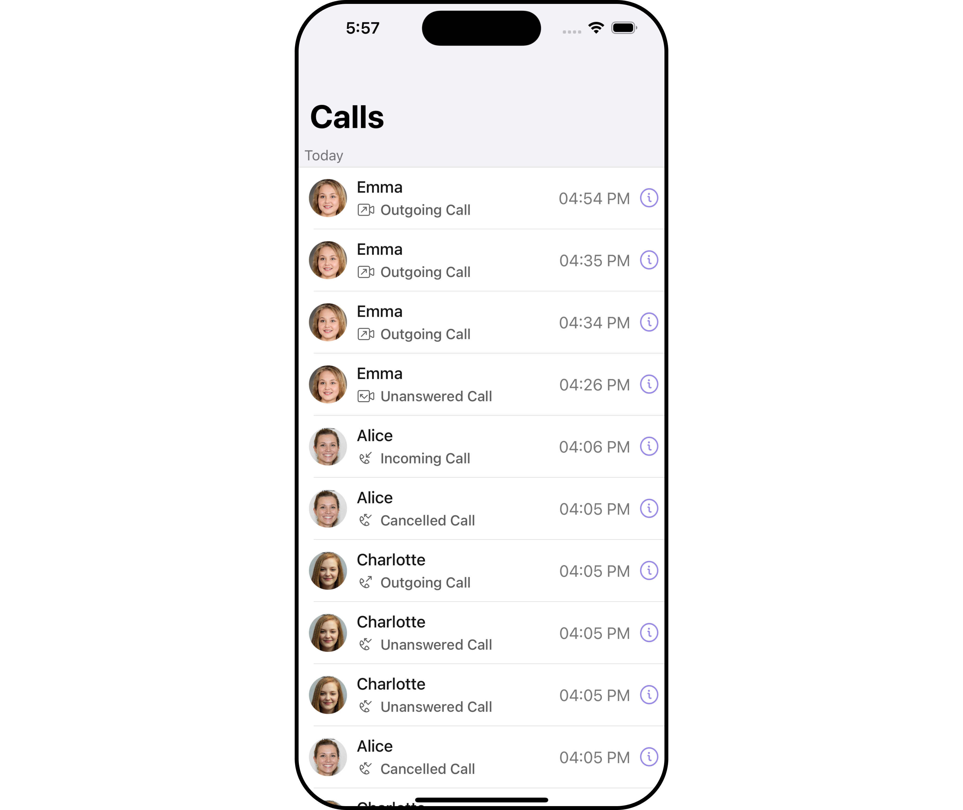
TheCometChatCallLogsWithDetails is a Composite Component encompassing components such as Call Logs and Call Log Details. Both of these component contributes to the functionality and structure of the overall CallLogsWithDetails component.
Usage
Integration
CometChatCallLogsWithDetails is a ViewController component that seamlessly integrates into your application. You can push it onto the navigation stack using a navigation controller. This allows for easy navigation and efficient display of call log details within your application’s interface.
- Swift
Actions
Actions dictate how a component functions. They are divided into two types: Predefined and User-defined. You can override either type, allowing you to tailor the behavior of the component to fit your specific needs.1. OnItemClick
This method proves valuable when users seek to override onItemClick functionality within CometChatCallLogsWithDetails, empowering them with greater control and customization options. ThesetOnItemClick action doesn’t have a predefined behavior. You can override this action using the following code snippet.
- Swift
2. OnError
You can customize this behavior by using the provided code snippet to override theOn Error and improve error handling.
- Swift
Filters
Filters allow you to customize the data displayed in a list within a Component. You can filter the list based on your specific criteria, allowing for a more customized. Filters can be applied using RequestBuilders of Chat SDK. While the CallLogsWithDetails component does not have filters, its components do, For more detail on individual filters of its component refer to Call Logs and Call Log Details. By utilizing the Configurations object of its components, you can apply filters.1. CallRequestBuilder
The callRequestBuilder enables you to filter and customize the call list based on available parameters in callRequestBuilder. This feature allows you to create more specific and targeted queries during the call. The following are the parameters available in callRequestBuilder| Method | Description | Code |
|---|---|---|
| authToken | Sets the auth token for the call logs request | .set(authToken: String?) |
| callCategory | Sets the call category for the call logs request | .set(callCategory: CallCategory) |
| callDirection | Sets the call direction for the call logs request | .set(callDirection: CallDirection) |
| callStatus | Sets the call status for the call logs request | .set(callStatus: CallStatus) |
| callType | Sets the call type for the call logs request | .set(callType: CallType) |
| guid | Sets the group ID for the call logs request | .set(guid: String) |
| hasRecording | Sets the recording status for the call logs request | .set(hasRecording: Bool) |
| limit | Sets the limit for the call logs request | .set(limit: Int) |
| uid | Sets the user ID for the call logs request | .set(uid: String) |
- Swift
Events
Events are emitted by aComponent. By using event you can extend existing functionality. Being global events, they can be applied in Multiple Locations and are capable of being Added or Removed.
The Call LogsWithDetails component does not have any exposed events.
Customization
To fit your app’s design requirements, you can customize the appearance of the conversation component. We provide exposed methods that allow you to modify the experience and behavior according to your specific needs.Style
Using Style you can customize the look and feel of the component in your app, These parameters typically control elements such as the color, size, shape, and fonts used within the component. It’s important to note that whileCometChatCallLogsWithDetails does not provide its own specific styling options, each individual component contained within it offers its own set of styling attributes. This allows for granular customization of each component’s appearance to match your application’s design requirements and preferences.
1. CallLog Style
You can customize the appearance of theCallLog Component by applying the CallLogStyle to it using the following code snippet.
- Swift
| Property | Description | Code |
|---|---|---|
| callStatusTextFont | Sets the font for the call status text | .set(callStatusTextFont: UIFont) |
| missedCallTitleTint | Sets the tint for the missed call title | .set(missedCallTitleTint: UIColor) |
| callTimeTextFont | Sets the font for the call time text | .set(callTimeTextFont: UIFont) |
| dateSeparatorTextFont | Sets the font for the date separator text | .set(dateSeparatorTextFont: UIFont) |
| emptyStateTextFont | Sets the font for the empty state text | .set(emptyStateTextFont: UIFont) |
| errorStateTextFont | Sets the font for the error state text | .set(errorStateTextFont: UIFont) |
| callStatusTextColor | Sets the color for the call status text | .set(callStatusTextColor: UIColor) |
| callStatusIconTint | Sets the tint color for the call status icon | .set(callStatusIconTint: UIColor) |
| callTimeTextColor | Sets the color for the call time text | .set(callTimeTextColor: UIColor) |
| dateSeparatorTextColor | Sets the color for the date separator text | .set(dateSeparatorTextColor: UIColor) |
| missedCallIconTint | Sets the tint color for the missed call icon | .set(missedCallIconTint: UIColor) |
| outgoingCallIconTint | Sets the tint color for the outgoing call icon | .set(outgoingCallIconTint: UIColor) |
| incomingCallIconTint | Sets the tint color for the incoming call icon | .set(incomingCallIconTint: UIColor) |
| emptyStateTextColor | Sets the color for the empty state text | .set(emptyStateTextColor: UIColor) |
| errorStateTextColor | Sets the color for the error state text | .set(errorStateTextColor: UIColor) |
| infoIconTint | Sets the tint color for the info icon | .set(infoIconTint: UIColor) |
2. Avatar Styles
To apply customized styles to theAvatar component in the CallLogsWithDetails Component, you can use the following code snippet. For further insights on Avatar Styles refer
- Swift
Swift
3. ListItem Styles
To apply customized styles to theListItemStyle component in the CallLogsWithDetails Component, you can use the following code snippet. For further insights on ListItemStyle Styles refer
- Swift
Swift
Ensure to pass and present
CometChatCallLogsWithDetails. If a navigation controller is already in use, utilize the pushViewController function instead of directly presenting the view controller.Functionality
These are a set of small functional customizations that allow you to fine-tune the overall experience of the component. With these, you can change text, set custom icons, and toggle the visibility of UI elements.- Swift
| Property | Description | Code |
|---|---|---|
| titleFont | Sets the font for the title | .set(titleFont: UIFont) |
| titleColor | Sets the color for the title | .set(titleColor: UIColor) |
| title | Sets the title for the title bar | .set(title: String, mode: UINavigationItem.LargeTitleDisplayMode) |
| largeTitleFont | Sets the large title font | .set(largeTitleFont: UIFont) |
| backButtonTitle | Sets the back button title | .set(backButtonTitle: String?) |
| largeTitleColor | Sets the large title color | .set(largeTitleColor: UIColor) |
| backButtonTitleColor | Sets the back button title color | .set(backButtonTitleColor: UIColor) |
| hide(search) | Hides the search bar | .hide(search: Bool) |
| hide(separator) | Hides the separator | .hide(separator: Bool) |
| hide(errorText) | Hides the error text | .hide(errorText: Bool) |
| callLog | Sets the call log | .set(callLog: Any?) |
| backButtonFont | Sets the back button font | .set(backButtonFont: UIFont?) |
| backButtonIcon | Sets the back button icon | .set(backButtonIcon: UIImage) |
| backButtonTint | Sets the back button tint | .set(backButtonTint: UIColor) |
| background | Sets the background | .set(background: [CGColor]?) |
| borderColor | Sets the border color | .set(borderColor: UIColor) |
| borderWidth | Sets the border width | .set(borderWidth: CGFloat) |
| corner | Sets the corner style | .set(corner: CometChatCornerStyle) |
| emptyStateText | Sets the empty state text | .set(emptyStateText: String) |
| emptyStateTextColor | Sets the empty state text color | .set(emptyStateTextColor: UIColor) |
| emptyStateTextFont | Sets the empty state text font | .set(emptyStateTextFont: UIFont) |
| errorStateText | Sets the error state text | .set(errorStateText: String) |
| errorStateTextColor | Sets the error state text color | .set(errorStateTextColor: UIColor) |
| errorStateTextFont | Sets the error state text font | .set(errorStateTextFont: UIFont) |
| searchBackground | Sets the search background | .set(searchBackground: UIColor) |
| searchIcon | Sets the search icon | .set(searchIcon: UIImage?) |
| searchPlaceholder | Sets the search placeholder | .set(searchPlaceholder: String) |
| searchIconTint | Sets the search icon tint | .set(searchIconTint: UIColor) |
| searchTextFont | Sets the search text font | .set(searchTextFont: UIFont) |
| searchBarHeight | Sets the search bar height | .set(searchBarHeight: CGFloat) |
| searchClearIcon | Sets the search clear icon | .set(searchClearIcon: UIImage) |
| searchTextColor | Sets the search text color | .set(searchTextColor: UIColor) |
| searchBorderColor | Sets the search border color | .set(searchBorderColor: UIColor) |
| searchBorderWidth | Sets the search border width | .set(searchBorderWidth: CGFloat) |
| searchCornerRadius | Sets the search corner radius | .set(searchCornerRadius: CometChatCornerStyle) |
| searchClearIconTint | Sets the search clear icon tint | .set(searchClearIconTint: UIColor) |
| searchPlaceholderColor | Sets the search placeholder color | .set(searchPlaceholderColor: UIColor) |
| searchCancelButtonFont | Sets the search cancel button font | .set(searchCancelButtonFont: UIFont) |
| searchCancelButtonTint | Sets the search cancel button tint | .set(searchCancelButtonTint: UIColor) |
| show backbutton | Whether to hide the back button | .show(backButton: Bool) |
| selection mode | Sets the selection mode | .selectionMode(mode: SelectionMode) |
| loading stateview style | Sets the style for loading stateview | .set(loadingStateView: UIActivityIndicatorView.Style) |
Advanced
For advanced-level customization, you can set custom views to the component. This lets you tailor each aspect of the component to fit your exact needs and application aesthetics. You can create and define your views, layouts, and UI elements and then incorporate those into the component.EmptyView report
You can set a custom EmptyView using.set(emptyView: UIView) to match the empty view of your app.
- Swift
Custom_Empty_State_GroupViewa UIView file.
- Swift
Ensure to pass and present
CometChatCallLogsWithDetails. If a navigation controller is already in use, utilize the pushViewController function instead of directly presenting the view controller.ErrorView report
You can set a custom ErrorView using.set(errorView: UIView) to match the error view of your app.
- Swift
Custom_ErrorState_GroupView and pass it inside the .set(errorView: UIView) method.
Custom_ErrorState_GroupView
- Swift
Ensure to pass and present
CometChatCallLogsWithDetails. If a navigation controller is already in use, utilize the pushViewController function instead of directly presenting the view controller.Menus
You can set the Custom Menus to add more options to the CometChatCallLogsWithDetails component.- Swift
- You can customize the menus for CometChatCallLogsWithDetails to meet your requirements
CometChatCallLogsWithDetails, enhancing its interface with a personalized menu for a more user-friendly experience.
- Swift
Ensure to pass and present
CometChatCallLogsWithDetails. If a navigation controller is already in use, utilize the pushViewController function instead of directly presenting the view controller.