Overview
CometChatCallLogParticipants is a Component that shows a separate view that displays comprehensive information about Call. This will enable users to easily access details such as the call participants, call details for a more informed communication experience.
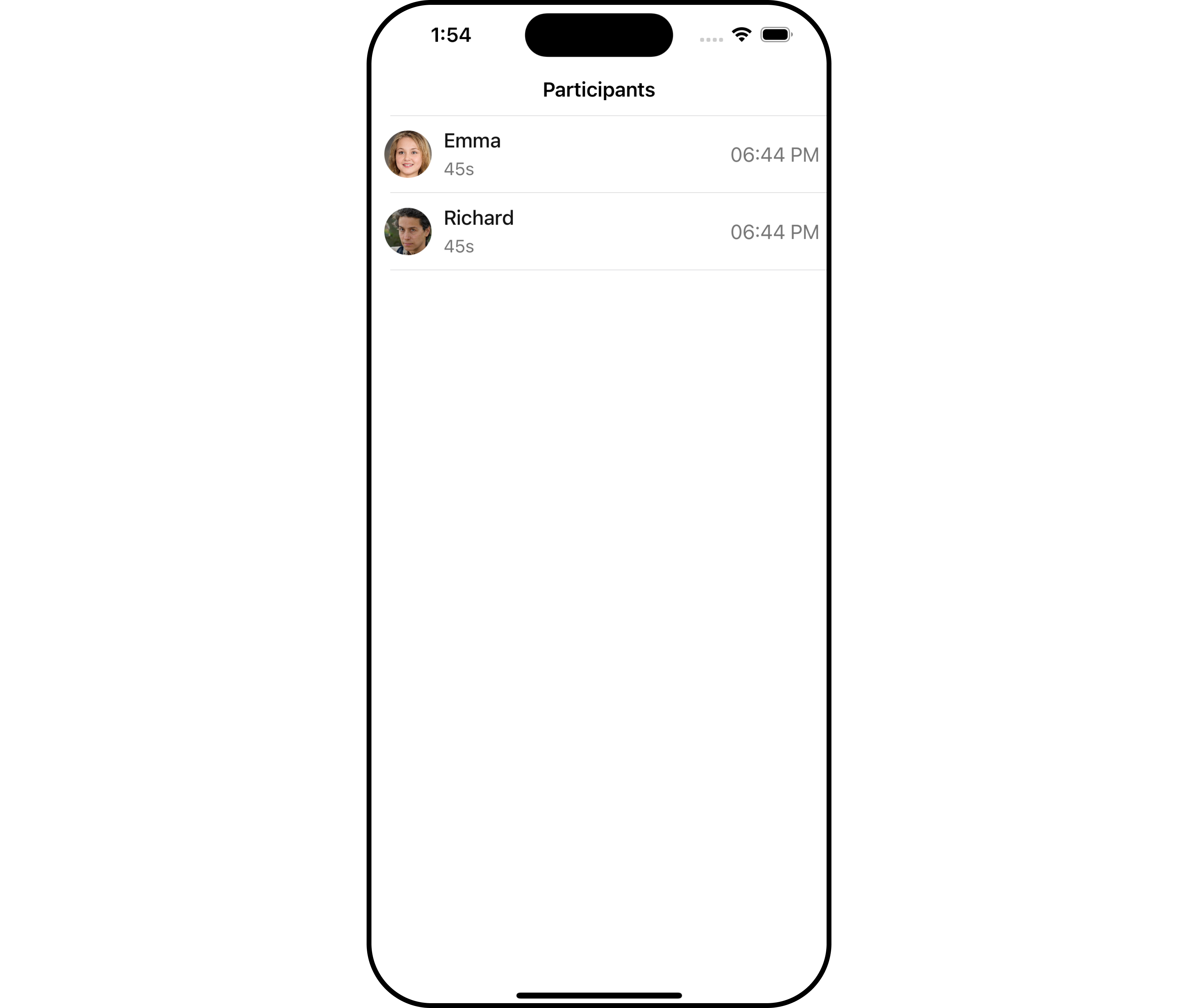
Call Log Participants component is composed of the following BaseComponents:
| Components | Description |
|---|---|
| CometChatListBase | CometChatListBase is a container component featuring a title, customizable background options, and a dedicated list view for seamless integration within your application’s interface. |
| CometChatListItem | This component displays data retrieved from a CallLog object on a card, presenting a title and subtitle. |
Usage
Integration
CometChatCallLogParticipants is a ViewController component that seamlessly integrates into your application. To present the participants of a call, you can instantiate the CometChatCallLogParticipants instance and provide the list of participants using its setter function. This allows for easy customization and efficient display of call participant details within your application’s interface.
- Swift
Actions
Actions dictate how a component functions. They are divided into two types: Predefined and User-defined. You can override either type, allowing you to tailor the behavior of the component to fit your specific needs.1. OnItemClicked
ThesetOnItemClicked action is typically triggered when a participant in the call log is clicked, executing a predefined action. However, by implementing the provided code snippet, you can effortlessly customize or override this default behavior to meet your specific requirements.
- Swift
Filters
Filters allow you to customize the data displayed in a list within a Component. You can filter the list based on your specific criteria, allowing for a more customized. Filters can be applied using RequestBuilders of Chat SDK. TheCall Log Participants component does not have any exposed filters.
Events
Events are emitted by aComponent. By using event you can extend existing functionality. Being global events, they can be applied in Multiple Locations and are capable of being Added or Removed.
The Call Log Participants component does not have any exposed events.
Customization
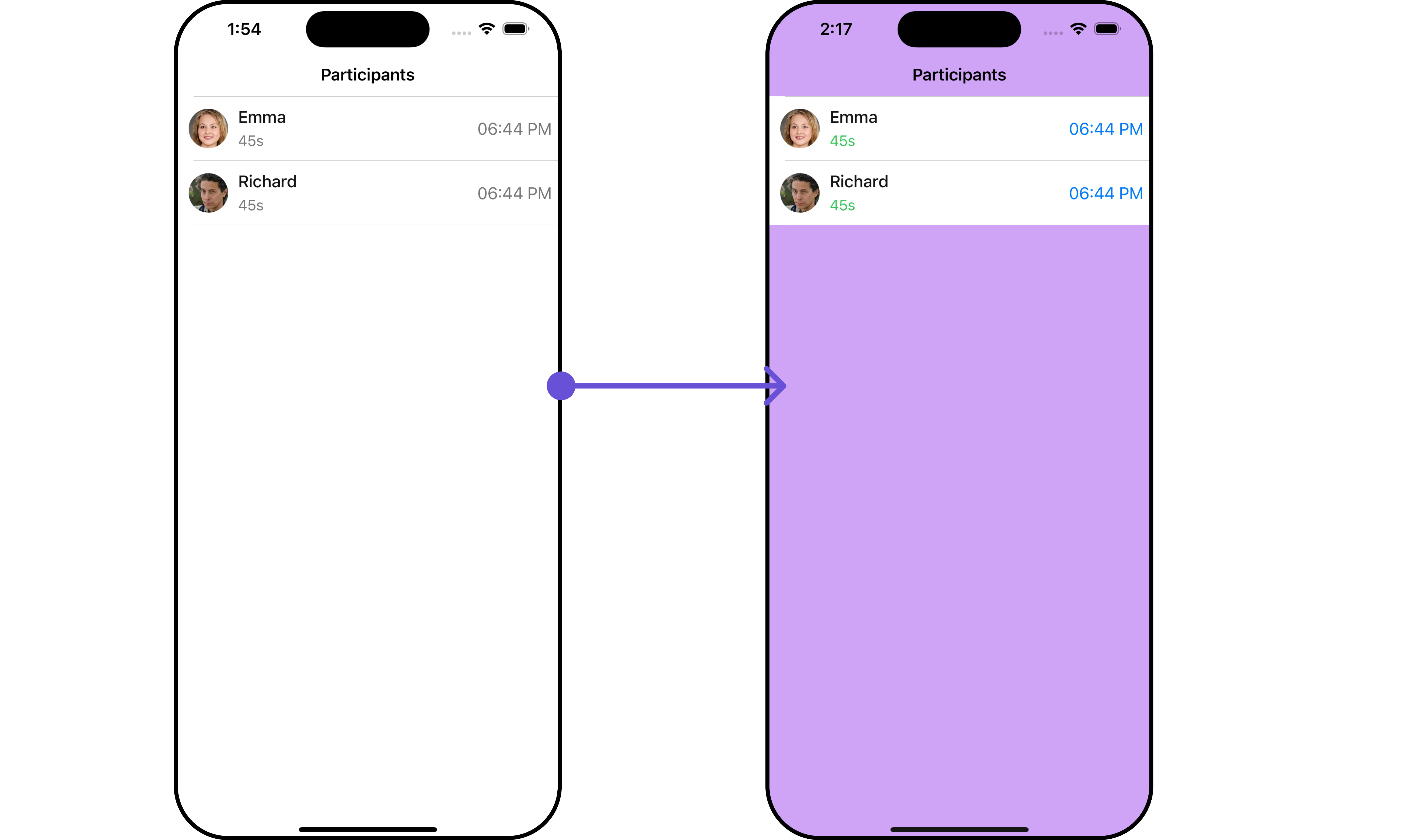
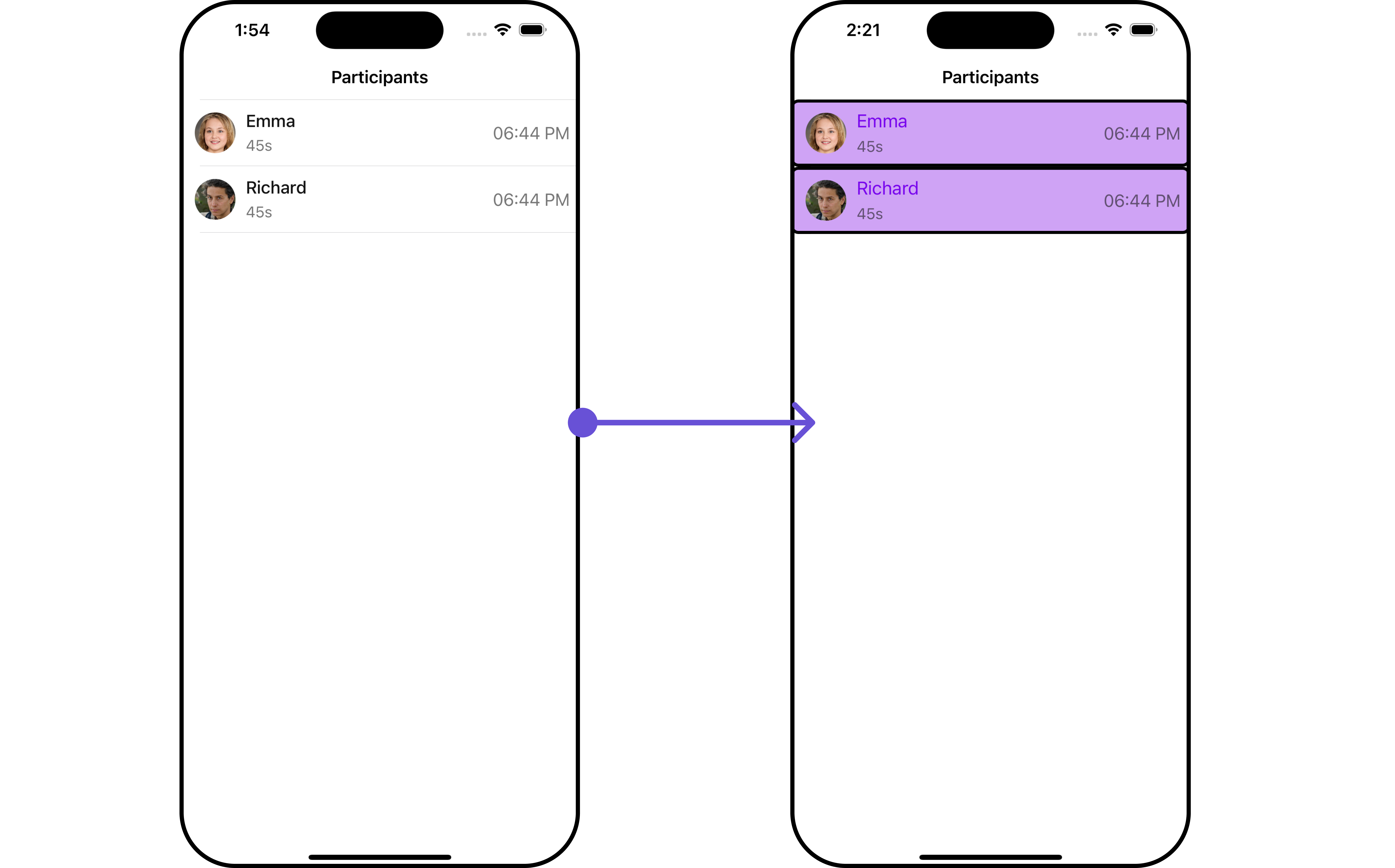
To fit your app’s design requirements, you can customize the appearance of the conversation component. We provide exposed methods that allow you to modify the experience and behavior according to your specific needs.Style
Using Style you can customize the look and feel of the component in your app, These parameters typically control elements such as the color, size, shape, and fonts used within the component.1. CallLogParticipant Style
You can customize the appearance of theCallLogParticipant Component by applying the CallLogParticipantStyle to it using the following code snippet.
- Swift
| Property | Description | Code |
|---|---|---|
| background | Sets the background color | .set(background: UIColor) |
| borderWidth | Sets the border width | .set(borderWidth: CGFloat) |
| bordercolor | Sets the border color | .set(borderColor: UIColor) |
| cornerRadius | Sets the corner radius | .set(cornerRadius: CometChatCornerStyle) |
| durationTextColor | Sets the text color of the duration text | .set(durationTextColor: UIColor) |
| durationTextFont | Sets the font of the duration text | .set(durationTextFont: UIFont) |
| joinedAtTextColor | Sets the text color of the Joined At text | .set(joinedAtTextColor: UIColor) |
| joinedAtTextFont | Sets the font of Joined At Text text | .set(joinedAtTextFont: UIFont) |
| nameTextFont | Sets the font of the name text | .set(nameTextFont: UIFont) |
2. ListItem Styles
To apply customized styles to theListItemStyle component in the CallLogParticipants Component, you can use the following code snippet. For further insights on ListItemStyle Styles refer
- Swift
Swift
Ensure to pass and present
CometChatCallLogParticipants. If a navigation controller is already in use, utilize the pushViewController function instead of directly presenting the view controller.Functionality
These are a set of small functional customizations that allow you to fine-tune the overall experience of the component. With these, you can change text, set custom icons, and toggle the visibility of UI elements.- Swift
| Property | Description | Code |
|---|---|---|
| titleFont | Sets the font for the title | .set(titleFont: UIFont) |
| titleColor | Sets the color for the title | .set(titleColor: UIColor) |
| title | Sets the title for the title bar | .set(title: String, mode: UINavigationItem.LargeTitleDisplayMode) |
| largeTitleFont | Sets the large title font | .set(largeTitleFont: UIFont) |
| backButtonTitle | Sets the back button title | .set(backButtonTitle: String?) |
| largeTitleColor | Sets the large title color | .set(largeTitleColor: UIColor) |
| backButtonTitleColor | Sets the back button title color | .set(backButtonTitleColor: UIColor) |
| hide(search) | Hides the search bar | .hide(search: Bool) |
| hide(separator) | Hides the separator | .hide(separator: Bool) |
| hide(errorText) | Hides the error text | .hide(errorText: Bool) |
| callLog | Sets the call log | .set(callLog: Any?) |
| backButtonFont | Sets the back button font | .set(backButtonFont: UIFont?) |
| backButtonIcon | Sets the back button icon | .set(backButtonIcon: UIImage) |
| backButtonTint | Sets the back button tint | .set(backButtonTint: UIColor) |
| background | Sets the background | .set(background: [CGColor]?) |
| borderColor | Sets the border color | .set(borderColor: UIColor) |
| borderWidth | Sets the border width | .set(borderWidth: CGFloat) |
| corner | Sets the corner style | .set(corner: CometChatCornerStyle) |
| emptyStateText | Sets the empty state text | .set(emptyStateText: String) |
| emptyStateTextColor | Sets the empty state text color | .set(emptyStateTextColor: UIColor) |
| emptyStateTextFont | Sets the empty state text font | .set(emptyStateTextFont: UIFont) |
| errorStateText | Sets the error state text | .set(errorStateText: String) |
| errorStateTextColor | Sets the error state text color | .set(errorStateTextColor: UIColor) |
| errorStateTextFont | Sets the error state text font | .set(errorStateTextFont: UIFont) |
| searchBackground | Sets the search background | .set(searchBackground: UIColor) |
| searchIcon | Sets the search icon | .set(searchIcon: UIImage?) |
| searchPlaceholder | Sets the search placeholder | .set(searchPlaceholder: String) |
| searchIconTint | Sets the search icon tint | .set(searchIconTint: UIColor) |
| searchTextFont | Sets the search text font | .set(searchTextFont: UIFont) |
| searchBarHeight | Sets the search bar height | .set(searchBarHeight: CGFloat) |
| searchClearIcon | Sets the search clear icon | .set(searchClearIcon: UIImage) |
| searchTextColor | Sets the search text color | .set(searchTextColor: UIColor) |
| searchBorderColor | Sets the search border color | .set(searchBorderColor: UIColor) |
| searchBorderWidth | Sets the search border width | .set(searchBorderWidth: CGFloat) |
| searchCornerRadius | Sets the search corner radius | .set(searchCornerRadius: CometChatCornerStyle) |
| searchClearIconTint | Sets the search clear icon tint | .set(searchClearIconTint: UIColor) |
| searchPlaceholderColor | Sets the search placeholder color | .set(searchPlaceholderColor: UIColor) |
| searchCancelButtonFont | Sets the search cancel button font | .set(searchCancelButtonFont: UIFont) |
| searchCancelButtonTint | Sets the search cancel button tint | .set(searchCancelButtonTint: UIColor) |
| participants | Sets the participants | .set(participants: [Any]?) |
| loading stateview style | Sets the style for loading stateview | .set(loadingStateView: UIActivityIndicatorView.Style) |
Advanced
For advanced-level customization, you can set custom views to the component. This lets you tailor each aspect of the component to fit your exact needs and application aesthetics. You can create and define your views, layouts, and UI elements and then incorporate those into the component.EmptyView report
You can set a custom EmptyView using.set(emptyView: UIView) to match the empty view of your app.
- Swift
Custom_Empty_State_GroupViewa UIView file.
- Swift
Ensure to pass and present
CometChatCallLogParticipants. If a navigation controller is already in use, utilize the pushViewController function instead of directly presenting the view controller.ErrorView report
You can set a custom ErrorView using.set(errorView: UIView) to match the error view of your app.
- Swift
Custom_ErrorState_GroupView and pass it inside the .set(errorView: UIView) method.
Custom_ErrorState_GroupView
- Swift
Ensure to pass and present
CometChatCallLogParticipants. If a navigation controller is already in use, utilize the pushViewController function instead of directly presenting the view controller.Menus
You can set the Custom Menus to add more options to the CometChatCallLogParticipants component.- Swift
- You can customize the menus for CometChatCallLogParticipants to meet your requirements
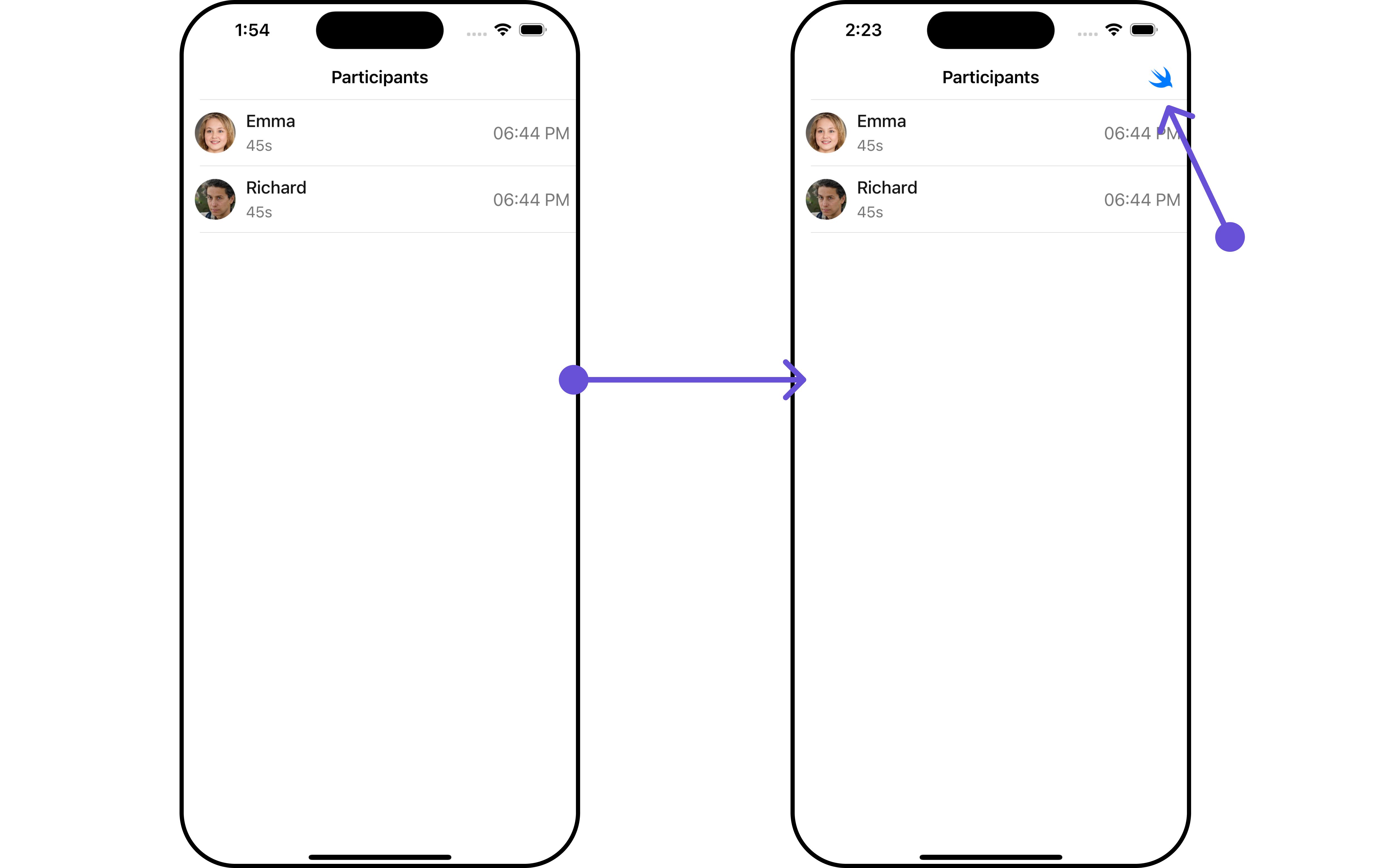
CallLogParticipants, enhancing its interface with a personalized menu for a more user-friendly experience.
- Swift
Ensure to pass and present
CometChatCallLogParticipants. If a navigation controller is already in use, utilize the pushViewController function instead of directly presenting the view controller.