Overview
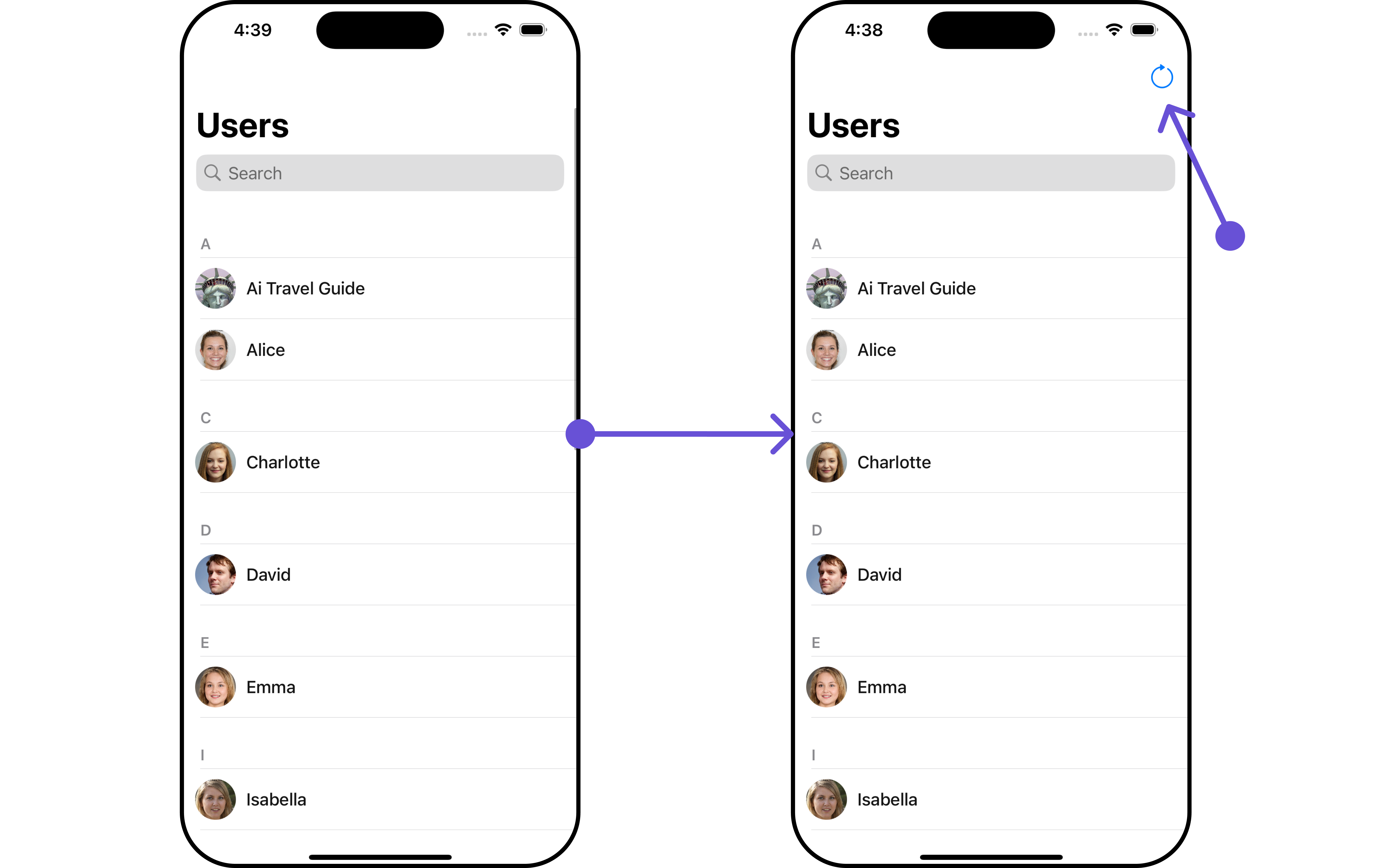
The Users is a Component, showcasing an accessible list of all available users. It provides an integral search functionality, allowing you to locate any specific user swiftly and easily. For each user listed, the widget displays the user’s name by default, in conjunction with their avatar when available. Furthermore, it includes a status indicator, visually informing you whether a user is currently online or offline.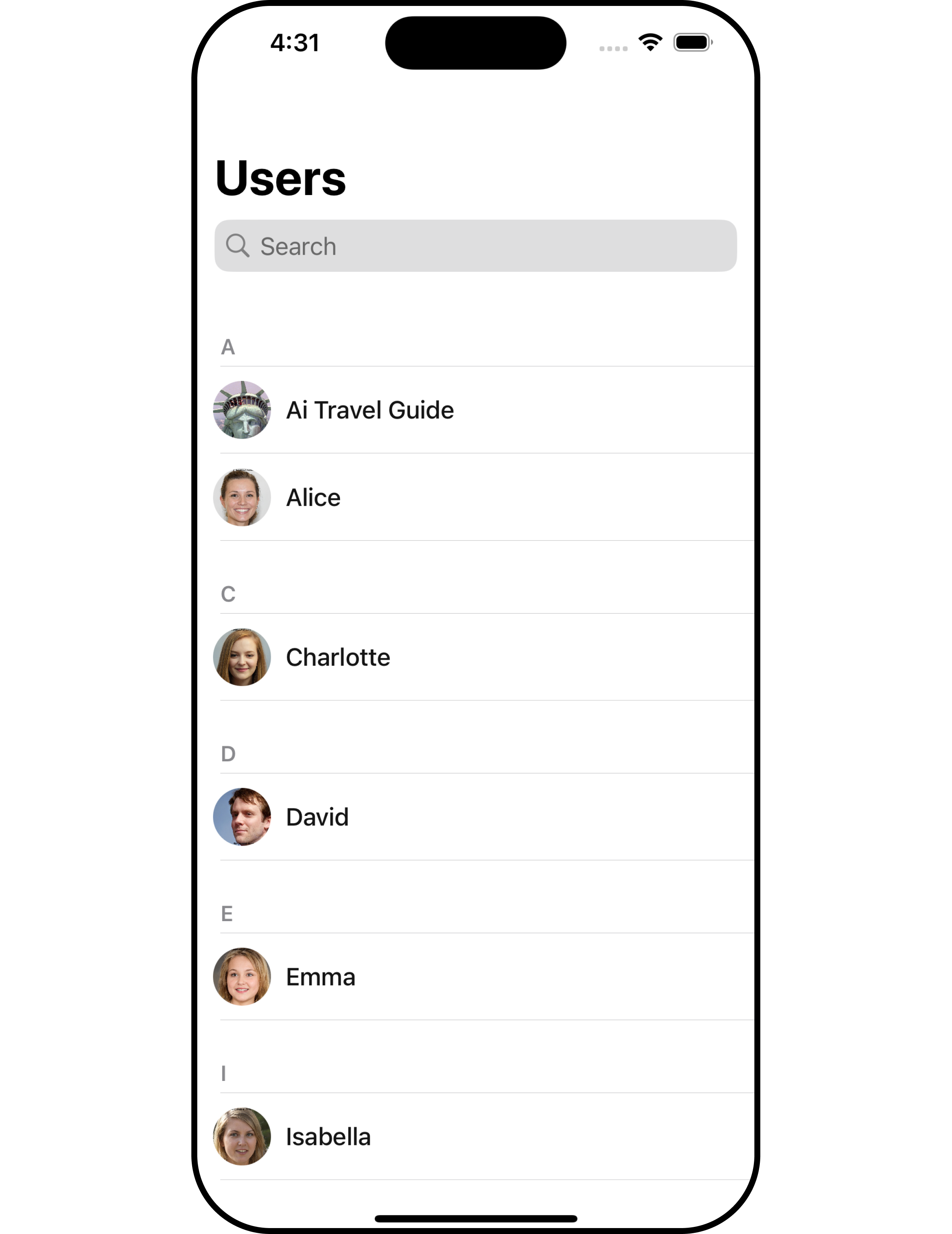
| Components | Description |
|---|---|
| ListBase | a reusable container component having title, search box, customisable background and a List View |
| ListItem | a component that renders data obtained from a User object on a Tile having a title, subtitle, leading and trailing view |
Usage
Integration
AsCometChatUsers is a custom view controller, it can be launched directly by user actions such as button clicks or other interactions. It’s also possible to integrate it into a tab view controller. CometChatUsers offers several parameters and methods for UI customization.
- Swift
Actions
Actions dictate how a component functions. They are divided into two types: Predefined and User-defined. You can override either type, allowing you to tailor the behavior of the component to fit your specific needs.1. OnSelection
When theonSelection event is triggered, it furnishes the list of selected users. This event can be invoked by any button or action within the interface. You have the flexibility to implement custom actions or behaviors based on the selected users.
This action does not come with any predefined behavior. However, you have the flexibility to override this event and tailor it to suit your needs using the following code snippet.
- Swift
2. SetOnItemClick
ThesetOnItemClick method is used to override the onClick behavior in CometChatUsers. This action does not come with any predefined behavior. However, you have the flexibility to override this event and tailor it to suit your needs using the following code snippet.
- Swift
3. SetOnBack
This method allows users to override the onBack Pressed behavior in CometChatUsers by utilizing thesetOnBack , providing customization options for handling the back action.
By default, this action has a predefined behavior: it simply dismisses the current view controller. However, the flexibility of CometChat UI Kit allows you to override this standard behavior according to your application’s specific requirements. You can define a custom action that will be performed instead when the back button is pressed.
- Swift
4. onError
This methodsetOnError, allows users to override error handling within CometChatUsers, providing greater control over error responses and actions.
- Swift
5. SetOnItemLongClick
This methodsetOnItemLongClick, empowers users to customize long-click actions within CometChatUsers, offering enhanced functionality and interaction possibilities.
- Swift
Filters
Filters allow you to customize the data displayed in a list within a Component. You can filter the list based on your specific criteria, allowing for a more customized. Filters can be applied using RequestBuilders of Chat SDK.1. UserRequestBuilder
The UserRequestBuilder enables you to filter and customize the user list based on available parameters in UserRequestBuilder. This feature allows you to create more specific and targeted queries when fetching users. The following are the parameters available in UserRequestBuilder| Methods | Type | Description |
|---|---|---|
| setLimit | int | sets the number users that can be fetched in a single request, suitable for pagination |
| setSearchKeyword | String | used for fetching users matching the passed string |
| hideBlockedUsers | bool | used for fetching all those users who are not blocked by the logged in user |
| friendsOnly | bool | used for fetching only those users in which logged in user is a member |
| setRoles | [String] | used for fetching users containing the passed tags |
| setTags | [String] | used for fetching users containing the passed tags |
| withTags | bool | used to fetch tags data along with the list of users. |
| setStatus | CometChat.UserStatus | used for fetching users by their status online or offline |
| setUIDs | [String] | used for fetching users containing the passed users |
- Swift
2. SearchRequestBuilder
The SearchRequestBuilder uses UserRequestBuilder enables you to filter and customize the search list based on available parameters in UserRequestBuilder. This feature allows you to keep uniformity between the displayed UserList and searched UserList. Example In the example below, we are applying a filter to the UserList based on Search.- Swift
Events
Events are emitted by aComponent. By using event you can extend existing functionality. Being global events, they can be applied in Multiple Locations and are capable of being Added or Removed.
To handle events supported by Users you have to add corresponding listeners by using CometChatUserEvents
| Events | Description |
|---|---|
| emitOnUserBlock | This will get triggered when the logged in user blocks another user |
| emitOnUserUnblock | This will get triggered when the logged in user unblocks another user |
- Swift
Swift
Customization
To fit your app’s design requirements, you can customize the appearance of the users component. We provide exposed methods that allow you to modify the experience and behavior according to your specific needs.Style
Using Style you can customize the look and feel of the component in your app, These parameters typically control elements such as the color, size, shape, and fonts used within the component.1. Users Style
You can set theUsersStyle to the Users Component to customize the styling.
- Swift
| Property | Description | Code |
|---|---|---|
| Background | Used to set the background color | .set(background: UIColor) |
| BorderWidth | Used to set border width | .set(borderWidth: CGFloat) |
| BorderColor | Used to set border color | .set(borderColor: UIColor) |
| CornerRadius | Used to set border radius | .set(cornerRadius: CometChatCornerStyle) |
| BackIconTint | Used to set the color of the back icon in the app bar | .set(backIconTint: UIColor) |
| SearchBackground | Used to set the background color of the search box | .set(searchBackgroundColor: UIColor) |
| SearchBorderRadius | Used to set the border radius of the search box | .set(searchBorderRadius: CometChatCornerStyle) |
| SearchIconTint | Used to set the color of the search icon in the search box | .set(searchIconTint: UIColor) |
| SearchBorderWidth | Used to set the border width of the search box | .set(searchBorderWidth: CGFloat) |
| OnlineStatusColor | Used to set the color of the status indicator shown if a group member is online | .set(onlineStatusColor: UIColor) |
| BackIconTint | Used to set the back icon tint color for Users | .set(backIconTint: UIColor) |
| SearchCancelButtonTint | Used to set the search cancel icon tint for Users | .set(searchCancelButtonTint: UIColor) |
| SearchPlaceholderFont | Used to set the search placeholder font for Users | .set(searchPlaceholderFont: UIFont) |
| SearchPlaceholderColor | Used to set the search placeholder color for Users | .set(searchPlaceholderColor: UIColor) |
| LargeTitleColor | Used to set the large title color for Users | .set(largeTitleColor: UIColor) |
| LargeTitleFont | Used to set the large title font for Users | .set(largeTitleFont: UIFont) |
| SearchTextColor | Used to set the search text color for Users | .set(searchTextColor: UIColor) |
| TitleColor | Used to set the title color for Users | .set(titleColor: UIColor) |
| TitleFont | Used to set the title font for Users | .set(titleFont: UIFont) |
2. Avatar Style
To apply customized styles to theAvatar component in the Users Component, you can use the following code snippet. For further insights on Avatar Styles refer
- Swift
3. StatusIndicator Style
To apply customized styles to the Status Indicator component in the Users Component, You can use the following code snippet. For further insights on Status Indicator Styles refer- Swift
Functionality
These are a set of small functional customizations that allow you to fine-tune the overall experience of the component. With these, you can change text, set custom icons, and toggle the visibility of UI elements.- Swift
| Property | Description | Code |
|---|---|---|
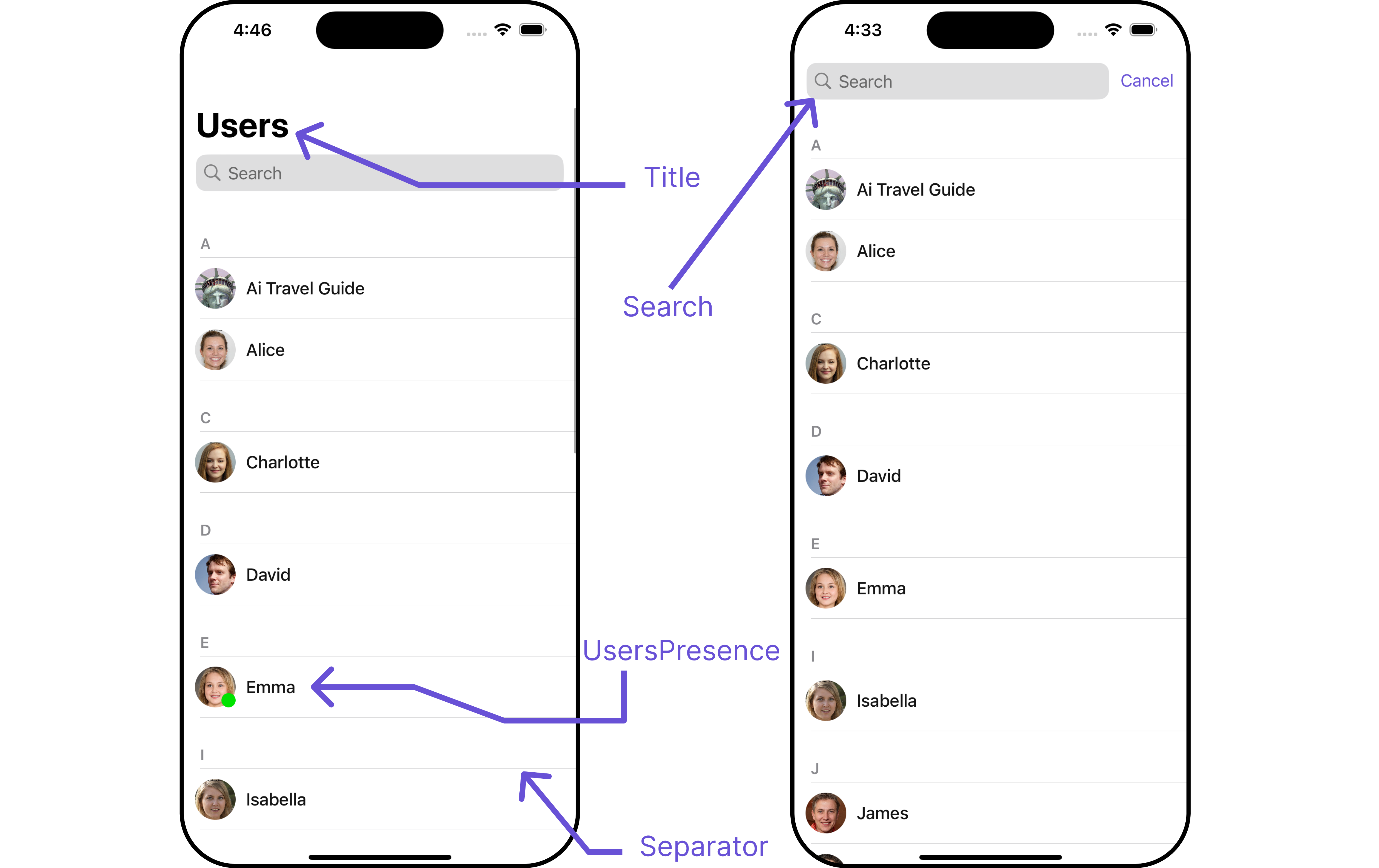
| Set Title | Used to set title in the app | .set(title: String, mode: UINavigationItem.LargeTitleDisplayMode) |
| Set SearchPlaceholderText | Used to set search placeholder text | .set(searchPlaceholder: String) |
| Show BackButton | Used to toggle visibility for back button | .show(backButton: Bool) |
| Set SearchIcon | Used to set search Icon in the search field | .set(searchIcon: UIImage?) |
| Hide Search | Used to toggle visibility for search box | .hide(search: Bool) |
| Hide Error Text | Used to hide error text on fetching users | .hide(errorText: Bool) |
| Hide Separator | Used to hide the divider separating the user items | .hide(separator: Bool) |
| Disable UsersPresence | Used to control visibility of user indicator shown if user is online | .disable(userPresence: Bool) |
| EmptyState Text | Used to set a custom text response when fetching the users has returned an empty list | .set(emptyStateText: String) |
| ErrorState Text | Used to set a custom text response when some error occurs on fetching the list of users | .set(errorStateText: String) |
| Loading StateView Style | Used to set size of loading view icon while fetching the list of users | .set(loadingStateView: UIActivityIndicatorView.Style) |
Advance
For advanced-level customization, you can set custom views to the component. This lets you tailor each aspect of the component to fit your exact needs and application aesthetics. You can create and define your views, layouts, and UI elements and then incorporate those into the component.SetListItemView
With this function, you can assign a custom ListItem to the users Component.- Swift
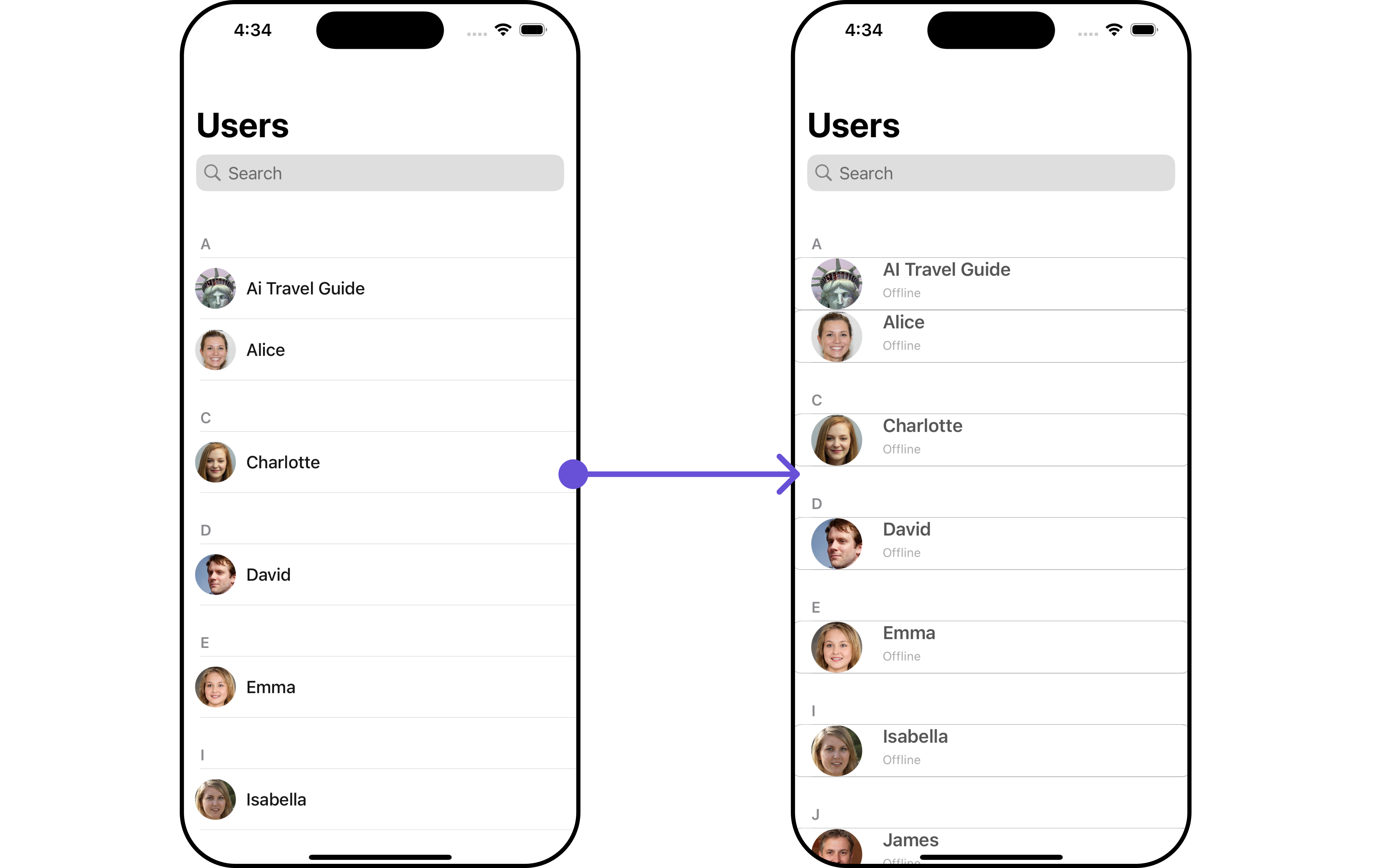
Custom_User_ListItem_View for more complex or unique list items.
Afterwards, seamlessly integrate this Custom_User_ListItem_View UIView file into the .setListItemView method within CometChatUsers().
- Swift
View controller
SetSubTitleView
You can customize the subtitle view for each users item to meet your requirements- Swift
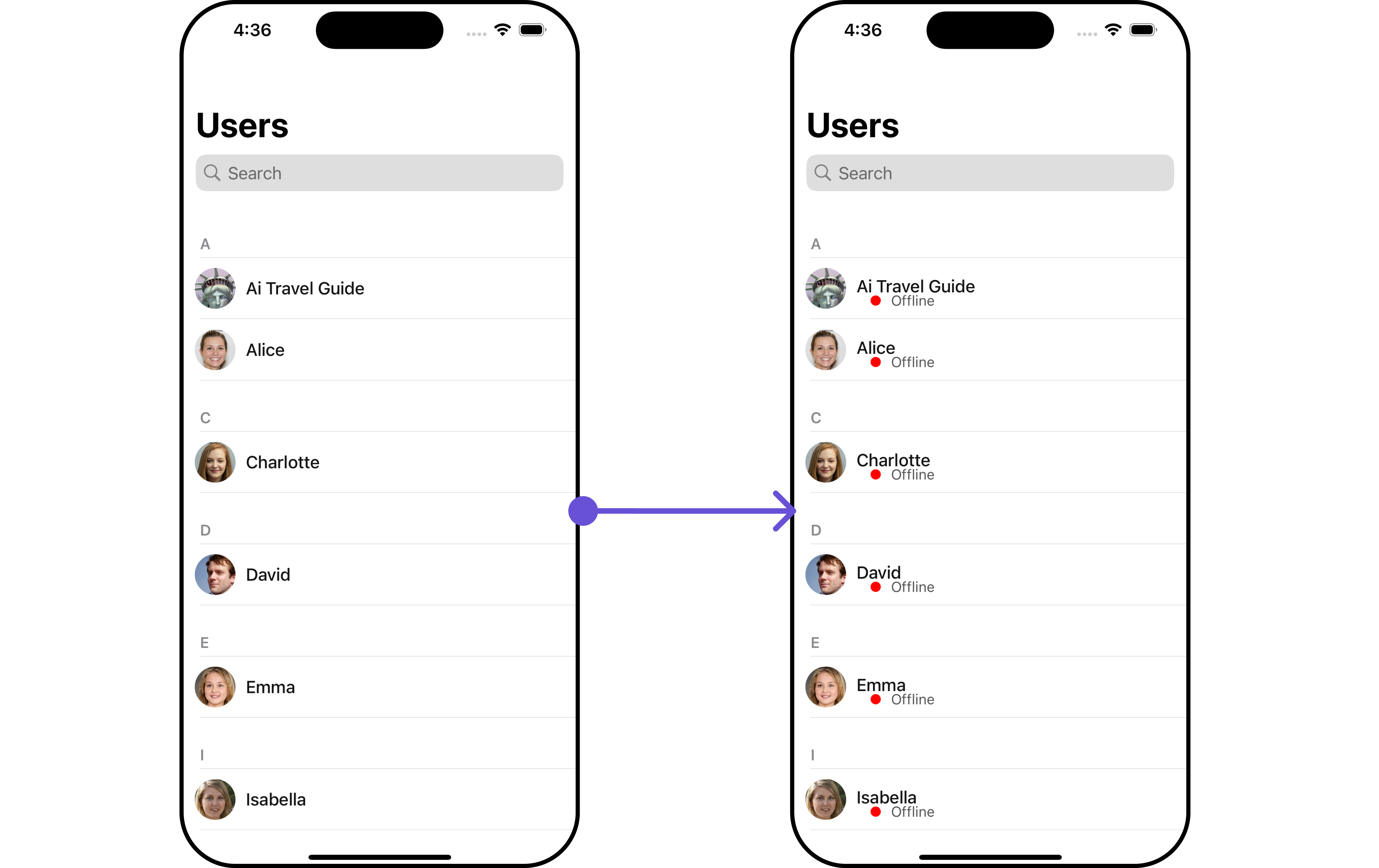
custom_user_subtitleview for more complex or unique list items.
Afterwards, seamlessly integrate this custom_user_subtitleview UIView file into the .setSubtitle method within CometChatUsers().
custom_user_subtitleview
- View Controller
SetMenu
You can set the Custom Menu view to add more options to the Users component.- Swift
Swift
- Swift
SetEmptyStateView
You can set a customEmptyStateView using setEmptyStateView to match the empty view of your app.
- Swift
Empty_View, you can set it as the empty state view by passing it as a parameter to the setEmptyView() method.
EmptyView
- Swift
View controller
SetErrorStateView
You can set a customErrorStateView using setErrorStateView to match the error view of your app.
- Swift
error_view UIView file, designed to improve user interaction during error states. Simply select the view of your preference and pass it to the .set(errorView: errorView) method for seamless integration.
error_view
- Swift
View controller