Overview
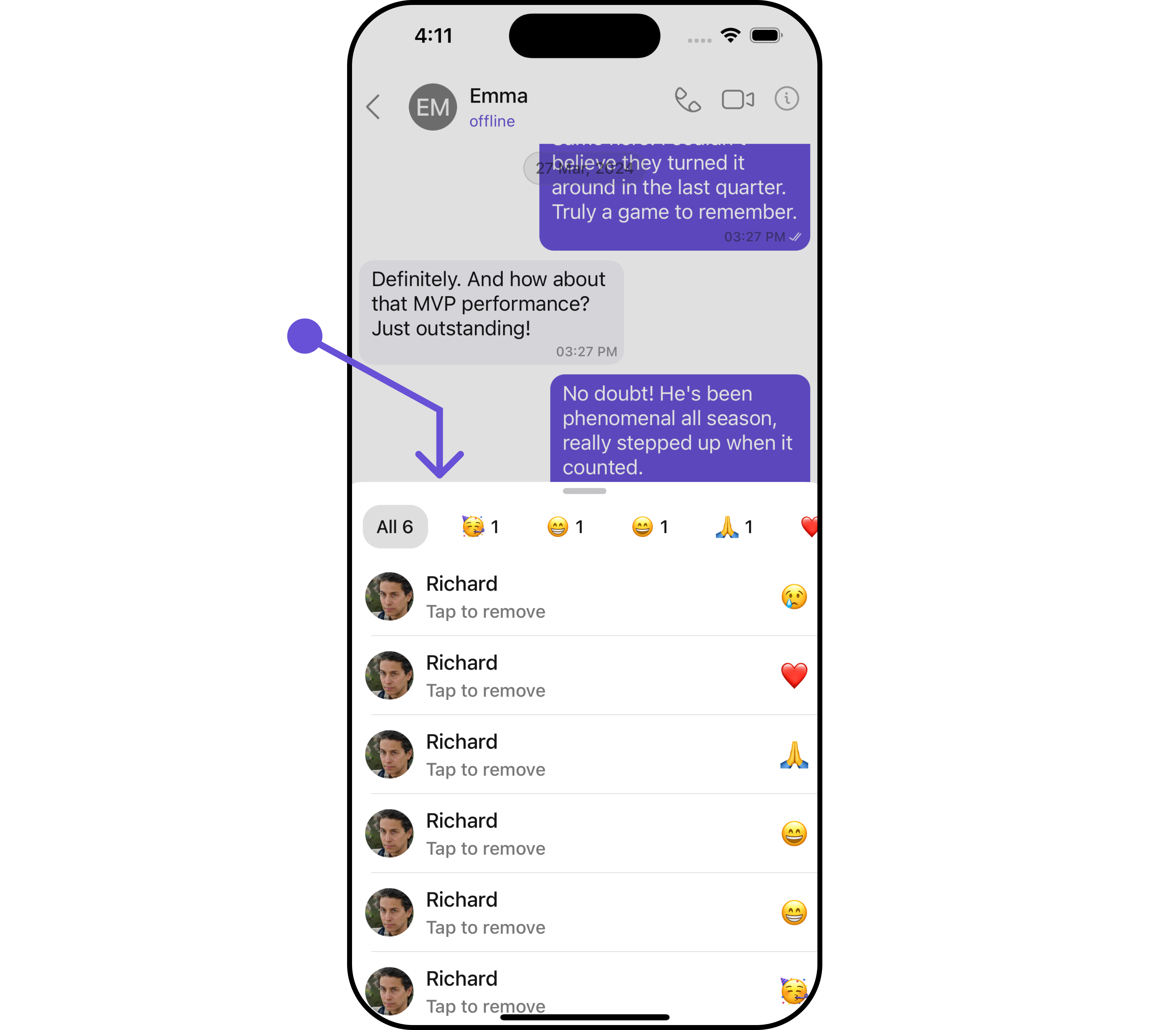
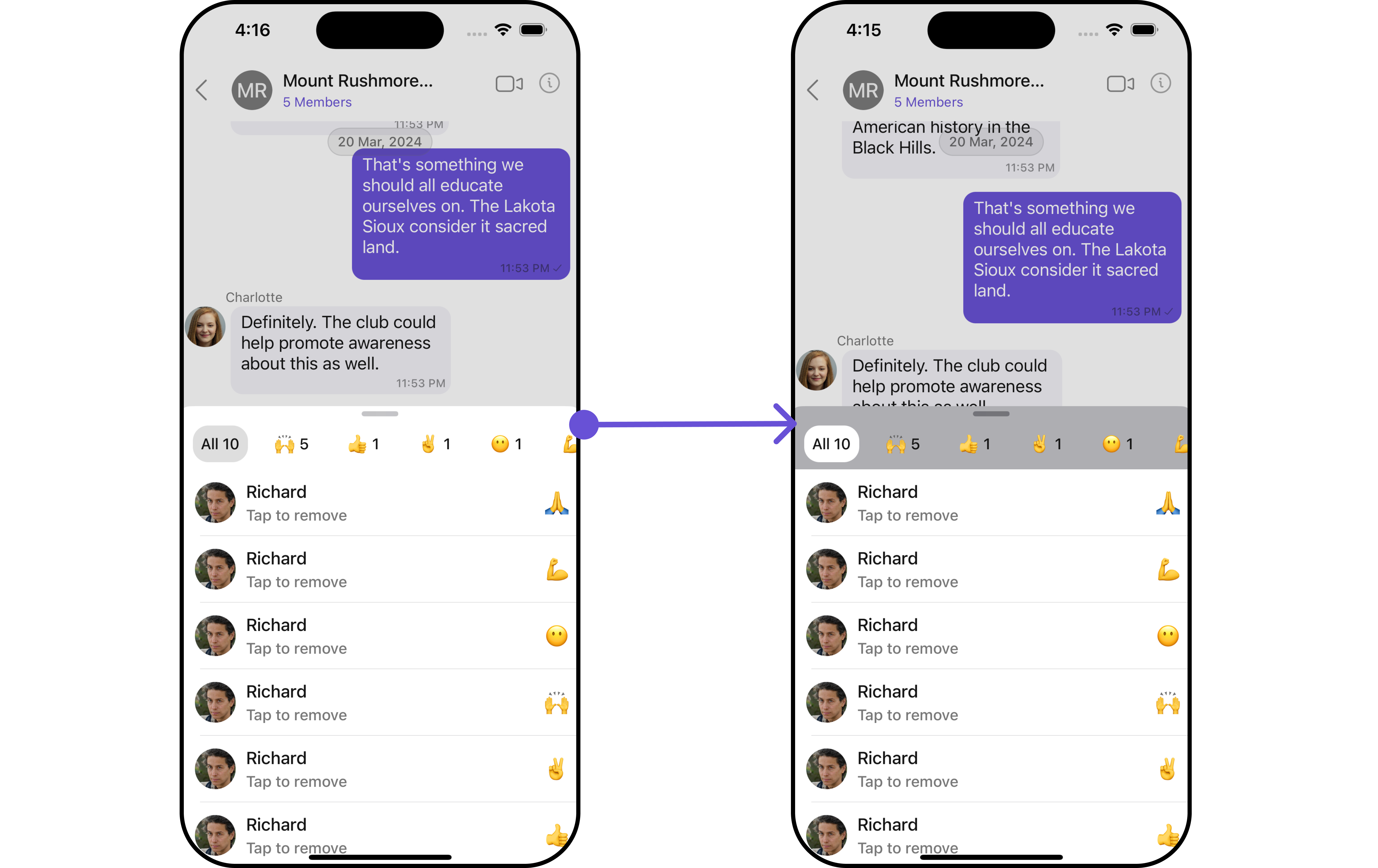
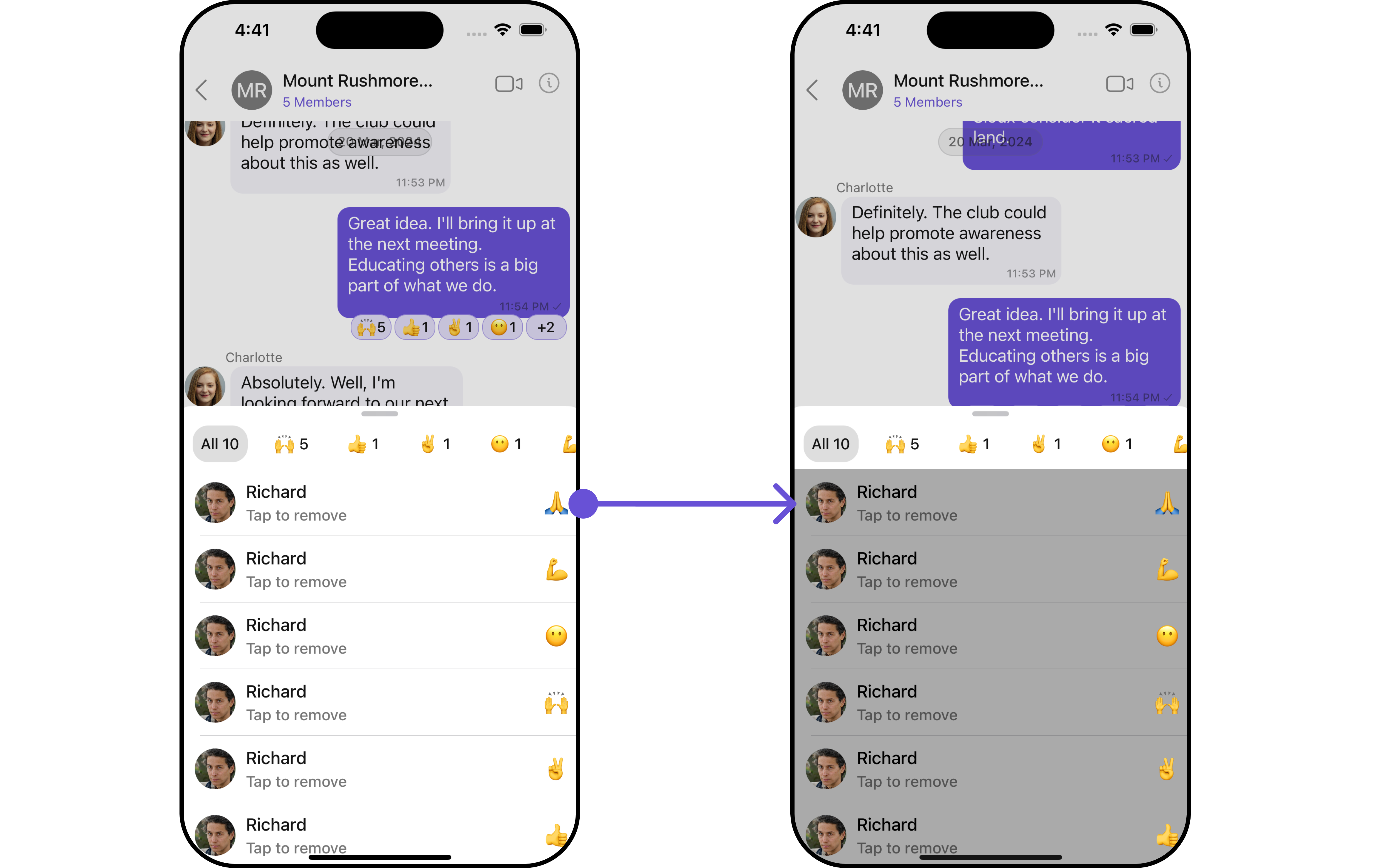
TheCometChatReactionsList component is designed to manage and display reactions associated with messages. It offers a user-friendly interface for users to express their reactions to messages and provides options to remove reactions when necessary. The component intelligently organizes reactions by emoji, giving a clear overview of the variety of reactions for a message along with details of who reacted with each emoji.
The component consists of two distinct lists: one at the top with horizontal scrolling to display unique reactions and their counts, allowing users to select reactions for further details. The middle list shows selected reactions and the users who reacted to them.
Additionally, the interface seamlessly integrates functionality to remove reactions added by the logged-in user.
Usage
Integration
CometChatReactionList is a UIViewController that contains a list of reactions. It is commonly used within the CometChatMessageList, but it can be integrated into any UIViewController. The component requires a list of reactions (provided via the baseMessage) to function properly.
If you are already using a
navigation controller, you can use the pushViewController function instead of presenting the view controller.Actions
Actions dictate how a component functions. They are divided into two types: Predefined and User-defined. You can override either type, allowing you to tailor the behavior of the component to fit your specific needs.1. OnClick
TheonClick event is triggered when a user interacts with a reaction by pressing it, typically to indicate a response or provide feedback.
- Swift
2. OnTappedToRemoveClicked
TheonTappedToRemoveClicked callback is triggered when a list item is tapped to remove.
- Swift
Filters
Filters enable customization of the displayed data in acomponent’s list by applying specific criteria. Using the ReactionsRequestBuilder in the Reaction List Component, you can customize your reaction list based on various options to suit your requirements. For more information about ReactionsRequestBuilder, refer to the documentation on ReactionsRequestBuilder.
In the example below, we illustrate how to apply a filter to the reactions list, allowing you to specify a limit on the number of users who have reacted to a particular message.
Swift
Ensure to pass and present
CometChatConversationsWithMessages. If a navigation controller is already in use, utilize the pushViewController function instead of directly presenting the view controller.Events
Events are triggered by a component, enabling you to enhance its functionality. These events are global in scope, making them applicable across multiple areas of your application, and they can be added or removed as required. TheReactions List component does not provide any available events.
Customization
For customization aligned with your app’s design, you can adjust the appearance of the Reaction List component using our accessible methods. These methods enable you to tailor the experience and behavior to suit your specific needs.Style
Through Style, you can customize the visual presentation of the component in your app. This includes controlling elements such as color, size, shape, and fonts to achieve the desired look and feel.1. Reactions List Style
The ReactionsListStyle class encapsulates properties that facilitate customization of theCometChatReactionsList component’s visual appearance.
- Swift
ReactionsListStyle to customize the appearance using setStyle method.
| Property | Description | Code |
|---|---|---|
| Background Color | Sets the background color | .set(background: UIColor) |
| Corner Radius | Sets the corner radius | .set(cornerRadius: CometChatCornerStyle) |
| Border Width | Sets the width of the border | .set(borderWidth: CGFloat) |
| Border Color | Sets the color of the border | .set(borderColor: UIColor) |
| Subtitle Color | Sets the subtitle color that has “Tap to remove” text | .set(subtitleColor: UIColor) |
| Subtitle Font | Sets the font for subtitle that has “Tap to remove” text | .set(subtitleFont: UIFont) |
| TailView Font | Sets the font for tailView that has reaction | .set(tailViewFont: UIFont) |
| Active Emoji Background Color | Sets the background color for selected emoji in the top slider | .set(activeEmojiBackgroundColor: UIColor) |
| Slider Emoji Count Color | Sets the UIColor for emojies count text in the top slidersl | .set(sliderEmojiCountColor: UIColor) |
| Error Text Color | Sets the color for error text | .set(errorTextColor: UIColor) |
| Error TextFont | Sets the error font | .set(errorTextFont: UIFont) |
| Loading Tint | Sets the loading tint color for loading spinner | .set(loadingTint: UIColor) |
| Active Emoji Corner Radius | Sets the corner radius for selected emoji in the top slider | .set(activeEmojiCornerRadius: CometChatCornerStyle) |
2. Avatar Style 🛑
If you want to apply customized styles to theAvatar component within the Reaction List Component, you can use the following code snippet. For more information you can refer Avatar Styles.
- Swift
3. ListItem Style
If you want to apply customized styles to theListItemStyle component within the Reaction List Component, you can use the following code snippet. For more information, you can refer ListItem Styles.
- Swift
Functionality
These functional customizations provide ways to enhance the component’s overall experience. They allow for text modification, custom icon setting, and UI element visibility toggling. TheReactions List component does not offer any additional functionality.
Advanced
For advanced-level customization, you can set custom views to the component. This lets you tailor each aspect of the component to fit your exact needs and application aesthetics. You can create and define your views, layouts, and UI elements and then incorporate those into the component.Loading State View
You can customize the loading state view in your Reaction List by using the.setLoadingStateView() method. This method allows you to set a custom loading view that will be displayed while the reaction list is loading. It’s important to note that using this method will override the default loading state functionality of the component.
- Swift
custom_loading_View.
CustomLoadingView
custom_loading_View to ReactionListConfiguration.
Swift
Ensure to pass and present
CometChatConversationsWithMessages. If a navigation controller is already in use, utilize the pushViewController function instead of directly presenting the view controller.Error State View
You can customize the error state view in your Reaction List by using the.setErrorStateView() method. This method allows you to set a custom error view that will be displayed when there’s an error in loading the reaction list. It’s important to note that using this method will override the default error state functionality of the component.
- Swift
Custom_Error_View.
CustomLoadingView
Custom_Error_View to ReactionListConfiguration.
Swift
Ensure to pass and present
CometChatConversationsWithMessages. If a navigation controller is already in use, utilize the pushViewController function instead of directly presenting the view controller.