Overview
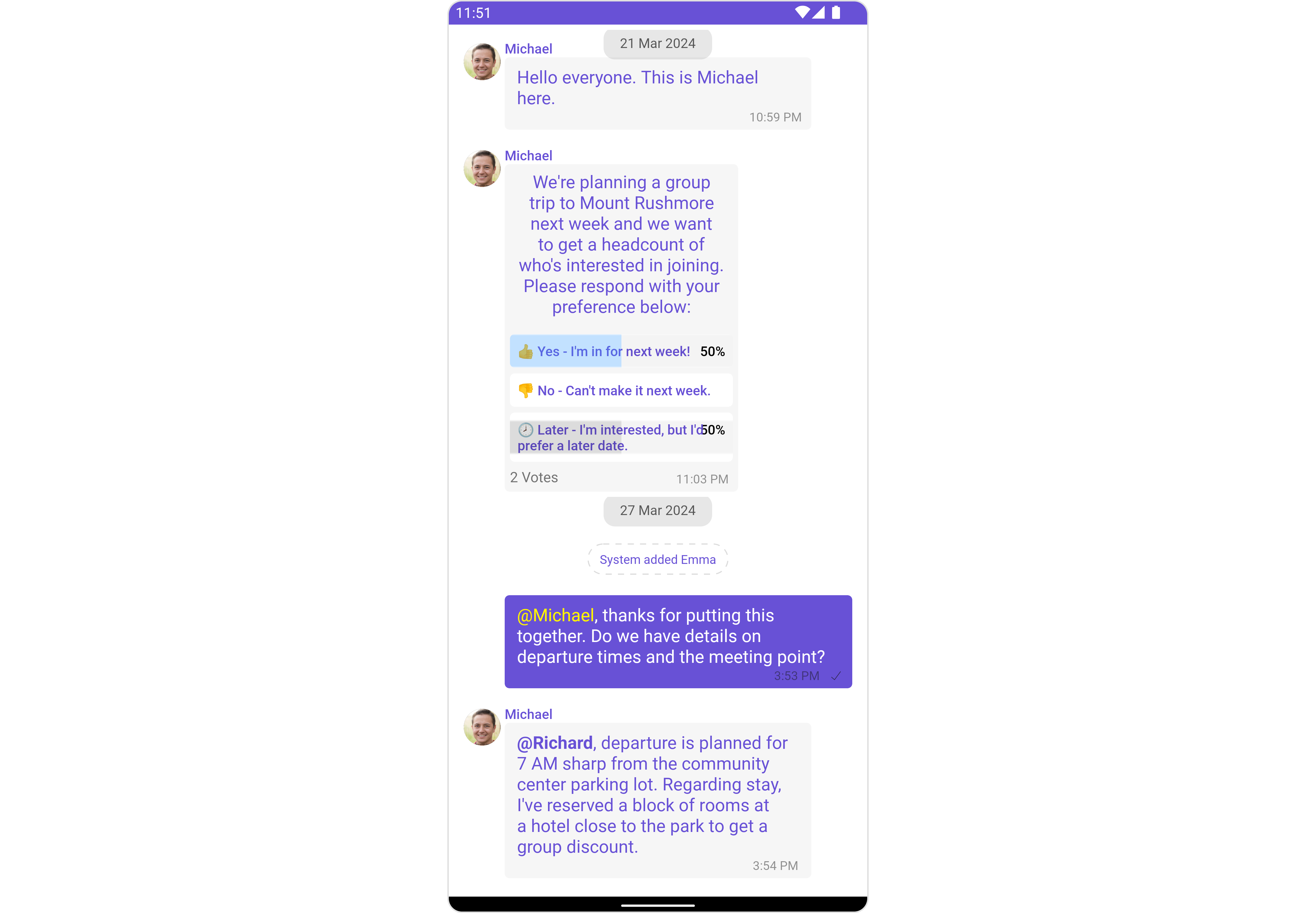
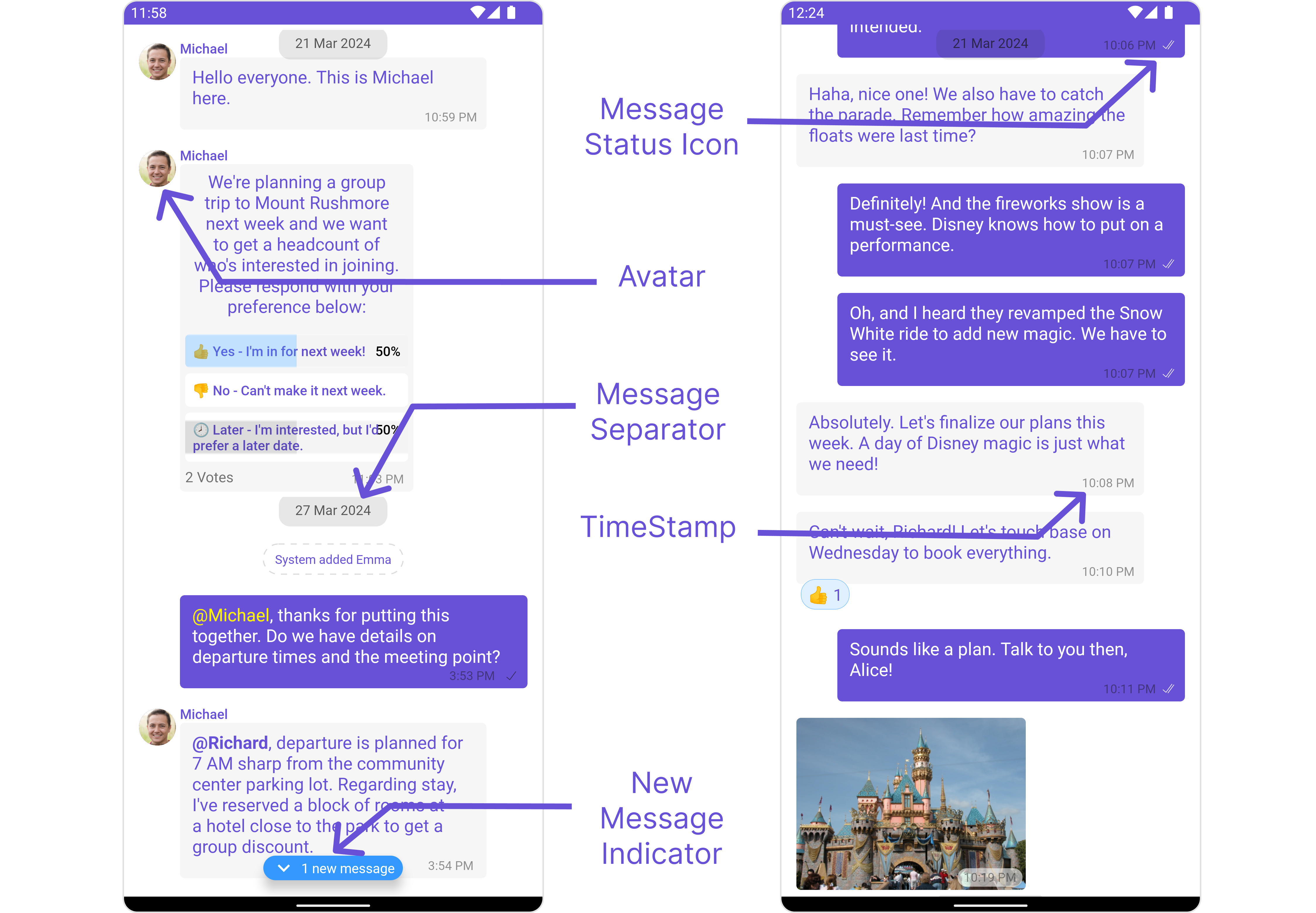
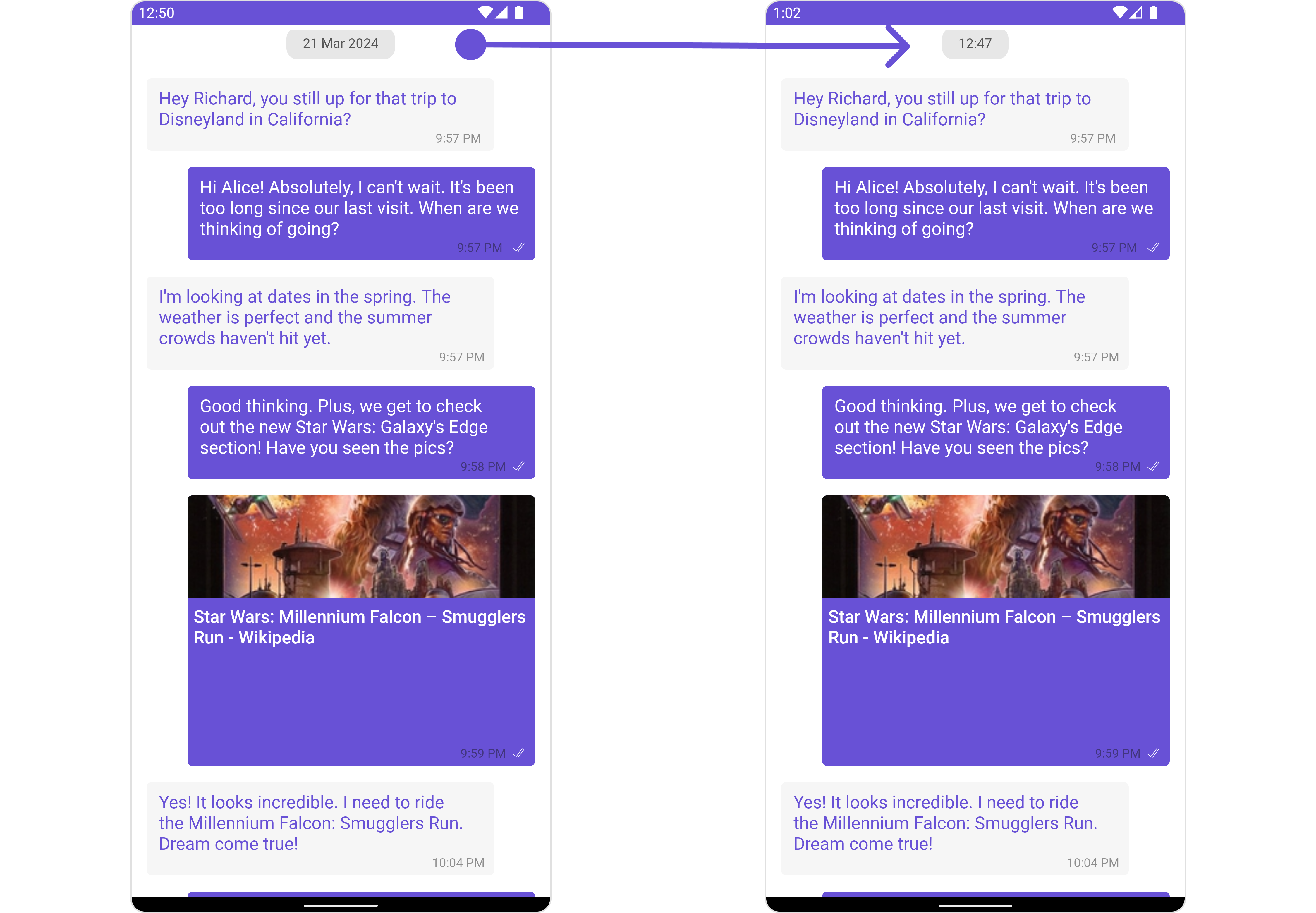
MessageList is a Composite Component that displays a list of messages and effectively manages real-time operations. It includes various types of messages such as Text Messages, Media Messages, Stickers, and more.
MessageList is primarily a list of the base component MessageBubble. The MessageBubble Component is utilized to create different types of chat bubbles depending on the message type.
Usage
Integration
The following code snippet illustrates how you can directly incorporate the MessageList component into yourlayout.xml file.
- XML
Simply adding the
MessageList component to the layout will only display the loading indicator. To fetch messages for a specific entity, you need to supplement it with User or Group Object.Actions
Actions dictate how a component functions. They are divided into two types: Predefined and User-defined. You can override either type, allowing you to tailor the behavior of the component to fit your specific needs.1. onThreadRepliesClick
onThreadRepliesClick is triggered when you click on the threaded message bubble. The onThreadRepliesClick action doesn’t have a predefined behavior. You can override this action using the following code snippet.
- Java
- Kotlin
setOnReactionClickListener
The listener to be set for reacting to a message.Pass a non-null instance of OnReactionClickListener to enable it. Example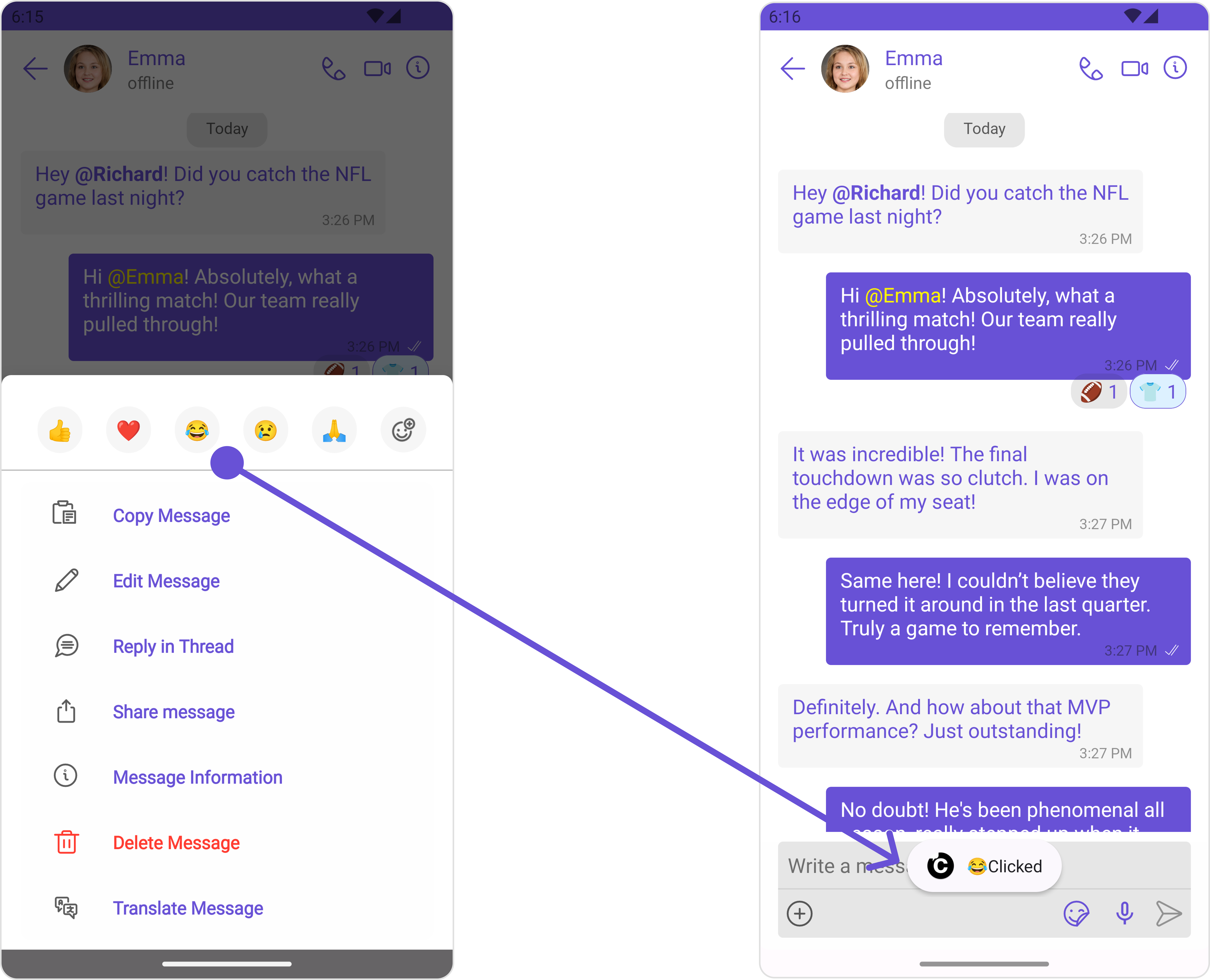
- Java
- Kotlin
YourActivity.java
setOnAddReactionClickListener
The listener to be set for adding reactions to a message.Pass a non-null instance of OnAddReactionClickListener to enable it. Example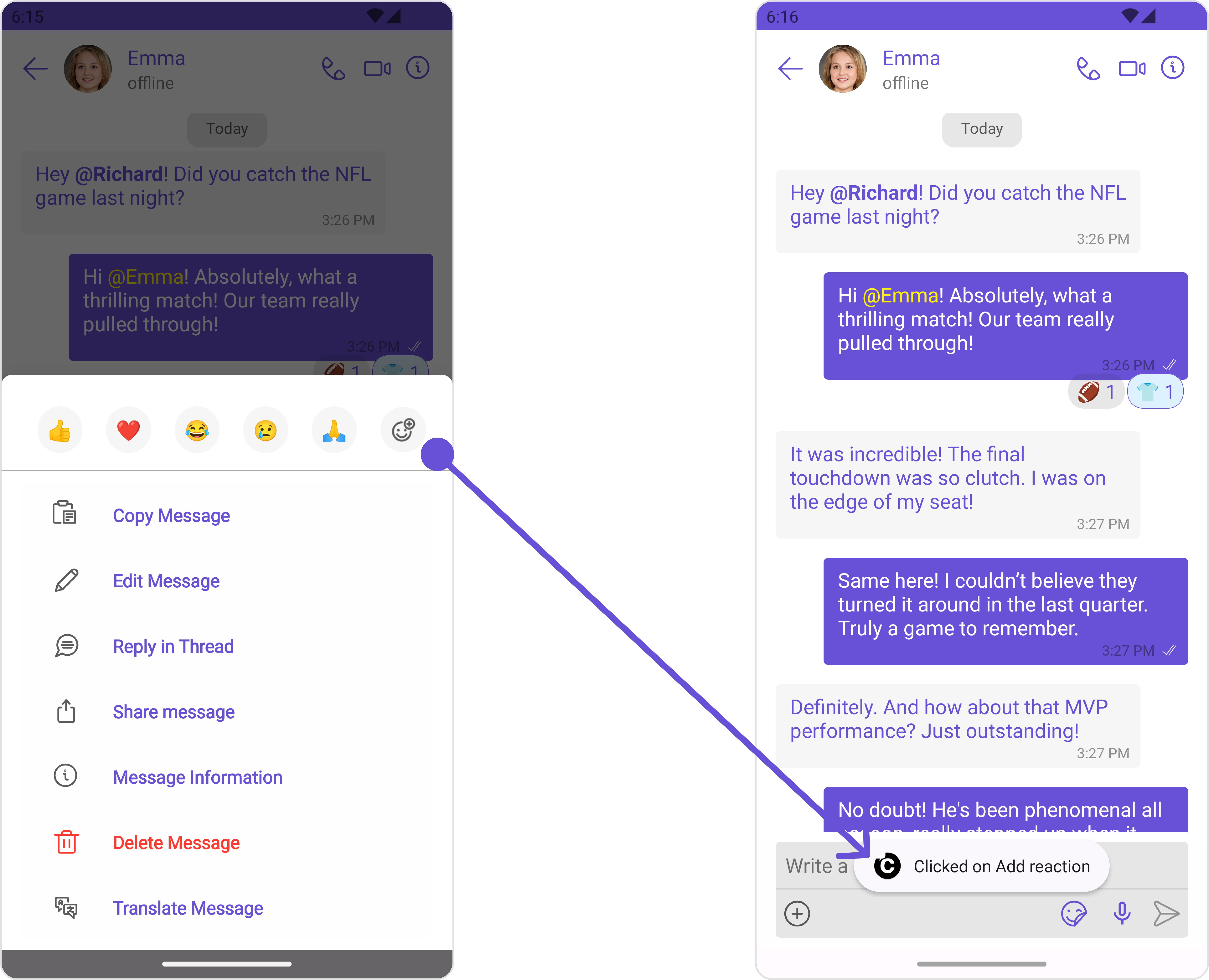
- Java
- Kotlin
YourActivity.java
2. onError
This action doesn’t change the behavior of the component but rather listens for any errors that occur in the MessageList component.- Java
- Kotlin
YourActivity.java
Filters
You can adjust theMessagesRequestBuilder in the MessageList Component to customize your message list. Numerous options are available to alter the builder to meet your specific needs. For additional details on MessagesRequestBuilder, please visit MessagesRequestBuilder.
In the example below, we are applying a filter to the messages based on a search substring and for a specific user. This means that only messages that contain the search term and are associated with the specified user will be displayed
- Java
- Kotlin
The following parameters in messageRequestBuilder will always be altered inside the message list
- UID
- GUID
- types
- categories
Events
Events are emitted by aComponent. By using event you can extend existing functionality. Being global events, they can be applied in Multiple Locations and are capable of being Added or Removed.
The MessageList Component does not emit any events of its own.
Customization
To fit your app’s design requirements, you can customize the appearance of the conversation component. We provide exposed methods that allow you to modify the experience and behavior according to your specific needs.Style
Using Style you can customize the look and feel of the component in your app, These parameters typically control elements such as the color, size, shape, and fonts used within the component.1. MessageList Style
You can set the MessageListStyle to the MessageList Component to customize the styling.- Java
- Kotlin
| Property | Description | Code |
|---|---|---|
| Border Width | used to set border width | .setBorderWidth(int) |
| Border Color | used to set border color | .setBorderColor(@ColorInt int) |
| Corner Radius | used to set corner radius | .setCornerRadius(int) |
| LoadingIcon Tint | used to set loading icon tint | .setLoadingIconTint(@ColorInt int) |
| EmptyText Appearance | used to set empty state text Appearance | .setLoadingIconTint(@StyleRes int) |
| ErrorText Appearance | used to set error text Appearance | .setErrorTextAppearance(@StyleRes int) |
| EmptyText Color | used to set empty state text color | .setEmptyTextColor(@ColorInt int) |
| ErrorText Color | used to set error state text color | .setErrorTextColor(@ColorInt int) |
| NameText Color | used to set sender/receiver name text color on a message bubble. | .setNameTextColor(@ColorInt int) |
| NameText Appearance | used to set sender/receiver name text appearance on a message bubble | .setNameTextAppearance(@StyleRes int) |
| TimeStampText Color | used to set time stamp text appearance | .setTimeStampTextAppearance(@StyleRes int) |
| ThreadReplySeparator Color | used to set thread reply separator color | .setThreadReplySeparatorColor(@ColorInt int) |
| ThreadReplyText Color | used to set thread reply text color | .setThreadReplyTextColor(@ColorInt int) |
| ThreadReplyText Appearance | used to set thread reply text appearance | .setThreadReplyTextAppearance(@StyleRes int) |
| ThreadReplyIcon Tint | used to set thread reply icon tint | .setThreadReplyIconTint(@ColorInt int) |
| Background | This method will set the background color for message list | .setBackground(@ColorInt int) |
| Background | This will set drawable component for list background | .setBackground(@drawable int) |
2. Avatar Style
To apply customized styles to theAvatar component in the Conversations Component, you can use the following code snippet. For more information, visit Avatar Styles.
- Java
- Kotlin
Functionality
These are a set of small functional customizations that allow you to fine-tune the overall experience of the component. With these, you can change text, set custom icons, and toggle the visibility of UI elements.- Java
- Kotlin
| Property | Description | Code |
|---|---|---|
| User | Used to pass user object of which header specific details will be shown | .setUser(user); |
| Group | Used to pass group object of which header specific details will be shown | .setGroup(Group); |
| Messages Alignment | used to set the alignmet of messages in CometChatMessageList. It can be either leftAligned or standard | .setAlignment(UIKitConstants.MessageListAlignment); |
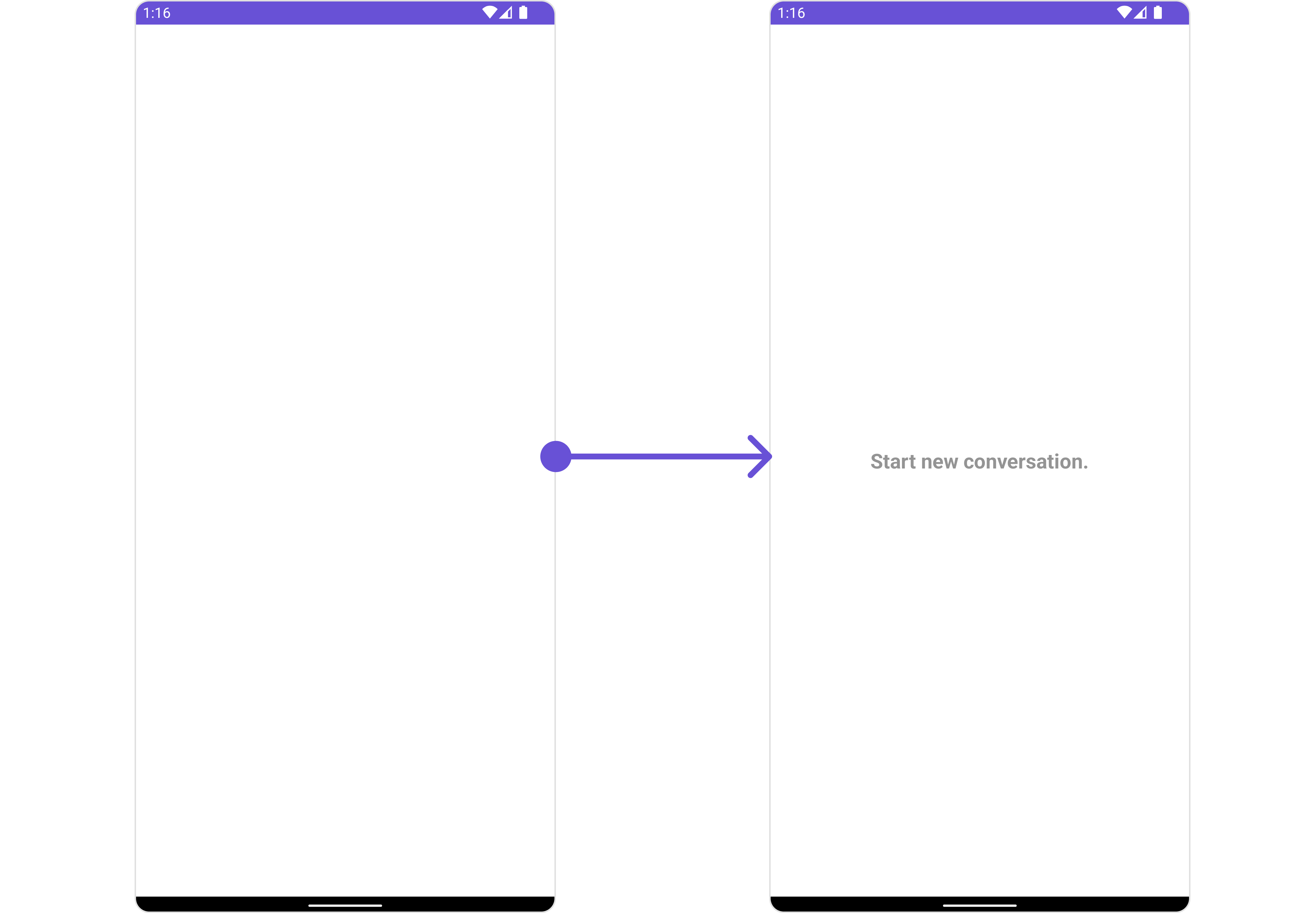
| EmptyState Text | used to set text which will be visible when no messages are available | .emptyStateText("Your_EMPTY_STATE_TEXT"); |
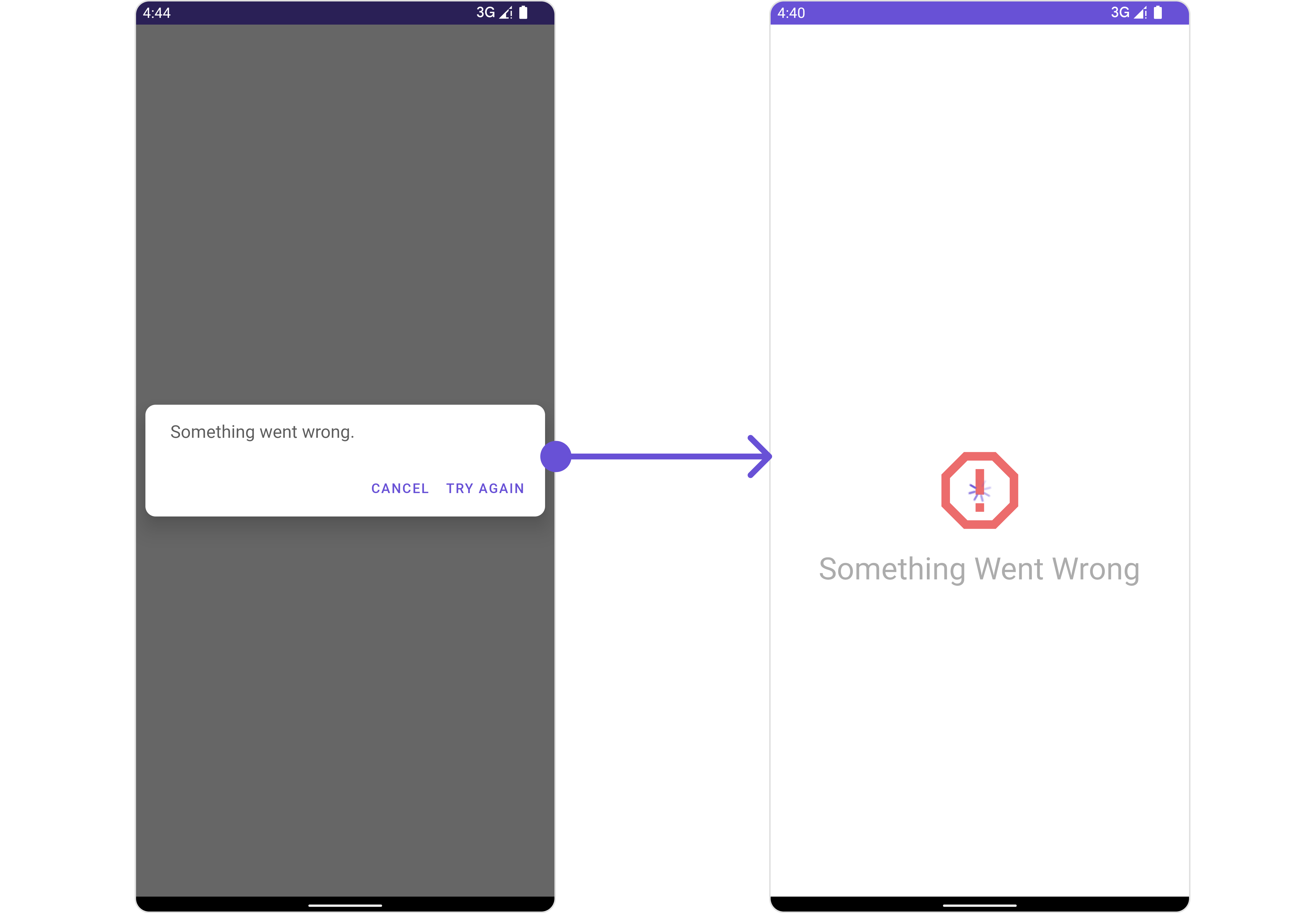
| ErrorState Text | used to set text which will be visible when error in messages retrieval | .errorStateText("Your_ERROR_STATE_TEXT"); |
| Hide Error | used to toggle visibility of error in MessageList | .hideError(false); |
| Disable Sound For Messages | used to enable/disable sound for incoming/outgoing messages , default false | .disableSoundForMessages(false); |
| CustomSound For Messages | used to set custom sound for outgoing message | .setCustomSoundForMessages(@RawRes resource); |
| Set ReadIcon | used to set custom read icon visible at read receipt | .setReadIcon(@DrawableRes resource); |
| Set DeliverIcon | used to set custom delivered icon visible at read receipt | .setDeliverIcon(@DrawableRes resource); |
| Set SentIcon | used to set custom sent icon visible at read receipt | .setSentIcon(@DrawableRes resource); |
| Set SentIcon | used to set custom sent icon visible at read receipt | .setSentIcon(@DrawableRes resource); |
| Set WaitIcon | used to set custom wait icon visible at read receipt | .setWaitIconIcon(@DrawableRes resource); |
| Show Avatar | used to toggle visibility for avatar | .showAvatar(false); |
| Hide Timestamp | used to toggle visibility for of timestamp | .hideTimestamp(false); |
| Set TimeStampAlignment | used to set receipt’s time stamp alignment .It can be either top or bottom | .setTimeStampAlignment(UIKitConstants.TimeStampAlignment); |
| Set newMessageIndicatorText | used to set new message indicator text | .newMessageIndicatorText("Your_CUSTOM_TEXT"); |
| Toggle scrollToBottomOnNewMessage | should scroll to bottom on new message? , by default false | .scrollToBottomOnNewMessage(true); |
| Toggle scrollToBottomOnNewMessage | should scroll to bottom on new message? , by default false | .scrollToBottomOnNewMessage(true); |
| Hide Receipt | Used to control visibility of read receipts without disabling the functionality of marking messages as read and delivered. | .hideReceipt(false); |
| Disable Mentions | Sets whether mentions in text should be disabled. Processes the text formatters If there are text formatters available and the disableMentions flag is set to true, it removes any formatters that are instances of CometChatMentionsFormatter. | .setDisableMentions(true); |
| Disable Reactions | Sets A boolean value indicating whether to disable reactions.Pass true to disable reactions, false to enable them. | .disableReactions(true); |
| Add Reaction Icon | Sets The resource ID to be set for the add reaction icon.This ID refers to the drawable resource representing the icon. | .setAddReactionIcon(R.drawable.your_icon); |
| Hide Add Reactions Icon | Sets A boolean value indicating whether to hide the add reactions icon. Pass true to hide the icon, false to show it. | .hideAddReactionsIcon(true); |
| Set Quick Reactions | The list of quick reactions to be set.This list will replace the predefined set of reactions | .setQuickReactions(Arrays.asList("👻","😈","🙀","🤡","❤️"); |
Advance
For advanced-level customization, you can set custom views to the component. This lets you tailor each aspect of the component to fit your exact needs and application aesthetics. You can create and define your views, layouts, and UI elements and then incorporate those into the component.SetTemplate
CometChatMessageTemplate is a pre-defined structure for creating message views that can be used as a starting point or blueprint for creating message views often known as message bubbles. For more information, you can refer to CometChatMessageTemplate. You can set message Templates to MessageList by using the following code snippet- Java
- Kotlin
Set DateSeparatorPattern
You can modify the date pattern of the message list date separator to your requirement usingsetDateSeparatorPattern(). This method accepts a function with a return type String. Inside the function, you can create your own pattern and return it as a String.
- Java
- Kotlin
- Java
- Kotlin
SetDatePattern
You can modify the date pattern to your requirement using .setDatePattern. This method accepts a function with a return type String. Inside the function, you can create your own pattern and return it as a String.- Java
- Kotlin
- Java
- Kotlin
SetErrorStateView
You can set a customErrorStateView using setEmptyStateView to match the error view of your app.
- Java
- Kotlin
error_state_view_layout.xml. You can choose any view you prefer. This view should be inflated and passed to the setErrorStateView() method.
error_state_view_layout.xml
- Java
- Kotlin
YourActivity.java
SetEmptyStateView
ThesetEmptyStateView() function provides the ability to set a custom empty state view in your app. An empty state view is displayed when there are no messages for a particular user.
- Java
- Kotlin
empty_view_layout.xml, you can set it as the empty state view by passing it as a parameter to the setEmptyStateView() function.
empty_view_layout.xml
- Java
- Kotlin
SetLoadingStateView
ThesetLoadingStateView function allows you to set a custom loading view in your app. This feature enables you to maintain a consistent look and feel throughout your application,
- Java
- Kotlin
ContentLoadingProgressBar to loading_view_layout.xml. You can choose any view you prefer. This view should be inflated and passed to the setLoadingStateView() method.
loading_view_layout.xml
- Java
- Kotlin
YourActivity.java
SetTextFormatters
Assigns the list of text formatters. If the provided list is not null, it sets the list. Otherwise, it assigns the default text formatters retrieved from the data source. To configure the existing Mentions look and feel check out MentionsFormatter Guide Example
- Java
- Kotlin
Configuration
Configurations offer the ability to customize the properties of each component within a Composite Component.MessageInformation
From the MessageList, you can navigate to the MesssageInformation component as shown in the image.
MessageInformationConfiguration object.
- Java
- Kotlin
MessageInformationConfiguration indeed provides access to all the Action, Filters, Styles, Functionality, and Advanced properties of the MesssageInformation component.
Please note that the properties marked with the 🛑 symbol are not accessible within the Configuration Object.
Example
MessageInformationConfiguration.