Theming allows you to define the look and feel of your app by adjusting colors, fonts, and other styles. Using CSS variables, you can create a consistent and on-brand chat experience.

Importing the Stylesheet

To enable theming, first, import the base stylesheet containing default styles and variables.
@import url("@cometchat/chat-uikit-react/css-variables.css");

Global Theming with CSS Variables

Customize the entire chat UI by overriding CSS variables in your global stylesheet.

Example: Changing Colors & Fonts

The following CSS variables customize colors, fonts, and other elements.
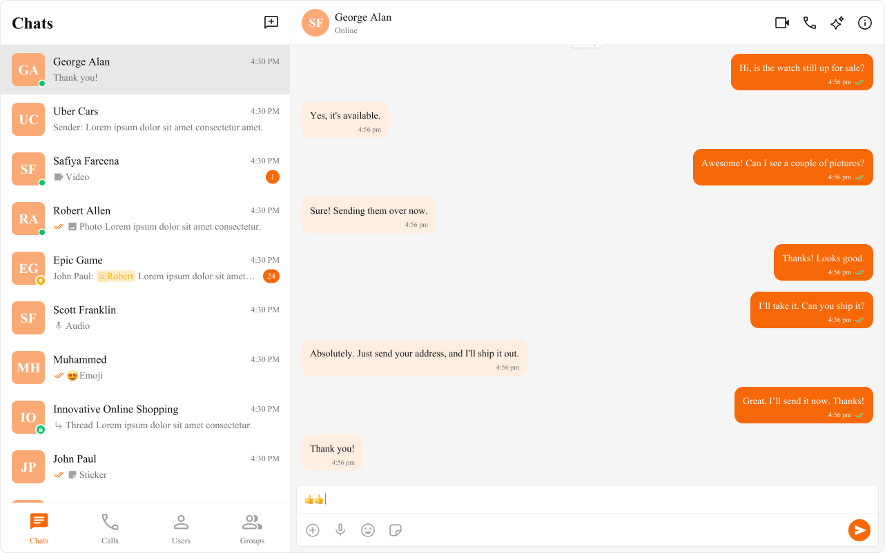
import { useEffect } from "react";

const App = () => {
  useEffect(() => {
    document.documentElement.style.setProperty(
      "--cometchat-font-family",
      "'Times New Roman'"
    );
  }, []);

  return <div className="cometchat-root">{/* Your chat UI here */}</div>;
};

export default App;

Component-Specific Theming

Want to apply different styles to specific components? Override CSS variables within the component’s class.
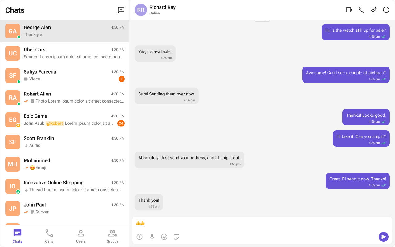
.cometchat .cometchat-conversations {
  --cometchat-primary-color: #f76808;
  --cometchat-extended-primary-color-500: #fbaa75;
  --cometchat-text-color-highlight: #ffab00;
  --cometchat-message-seen-color: #f76808;
  --cometchat-radius-max: 12px;
}

Advanced Customization with CSS Overrides

For full control over component styling, use CSS overrides.
.cometchat-conversations .cometchat-avatar,
.cometchat-conversations .cometchat-avatar__image {
  border-radius: 12px;
}

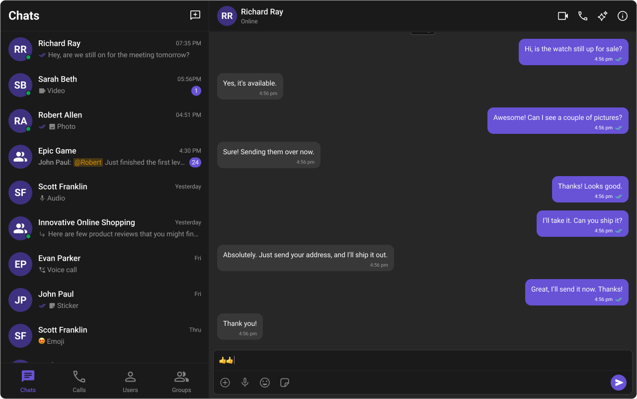
Dark & Light Theme Support

You can switch between light and dark modes.

Example: Enabling Dark Mode

import { useEffect, useState } from "react";

const App = () => {
  const [theme, setTheme] = useState("light");

  useEffect(() => {
    const mediaQuery = window.matchMedia("(prefers-color-scheme: dark)");
    setTheme(mediaQuery.matches ? "dark" : "light");

    const handleThemeChange = (e: MediaQueryListEvent) => {
      setTheme(e.matches ? "dark" : "light");
    };

    mediaQuery.addEventListener("change", handleThemeChange);
    return () => mediaQuery.removeEventListener("change", handleThemeChange);
  }, []);

  return <div className="cometchat-root" data-theme={theme}>{/* Chat UI here */}</div>;
};

export default App;

Customizing Light & Dark Theme

Define different color schemes for light and dark modes.
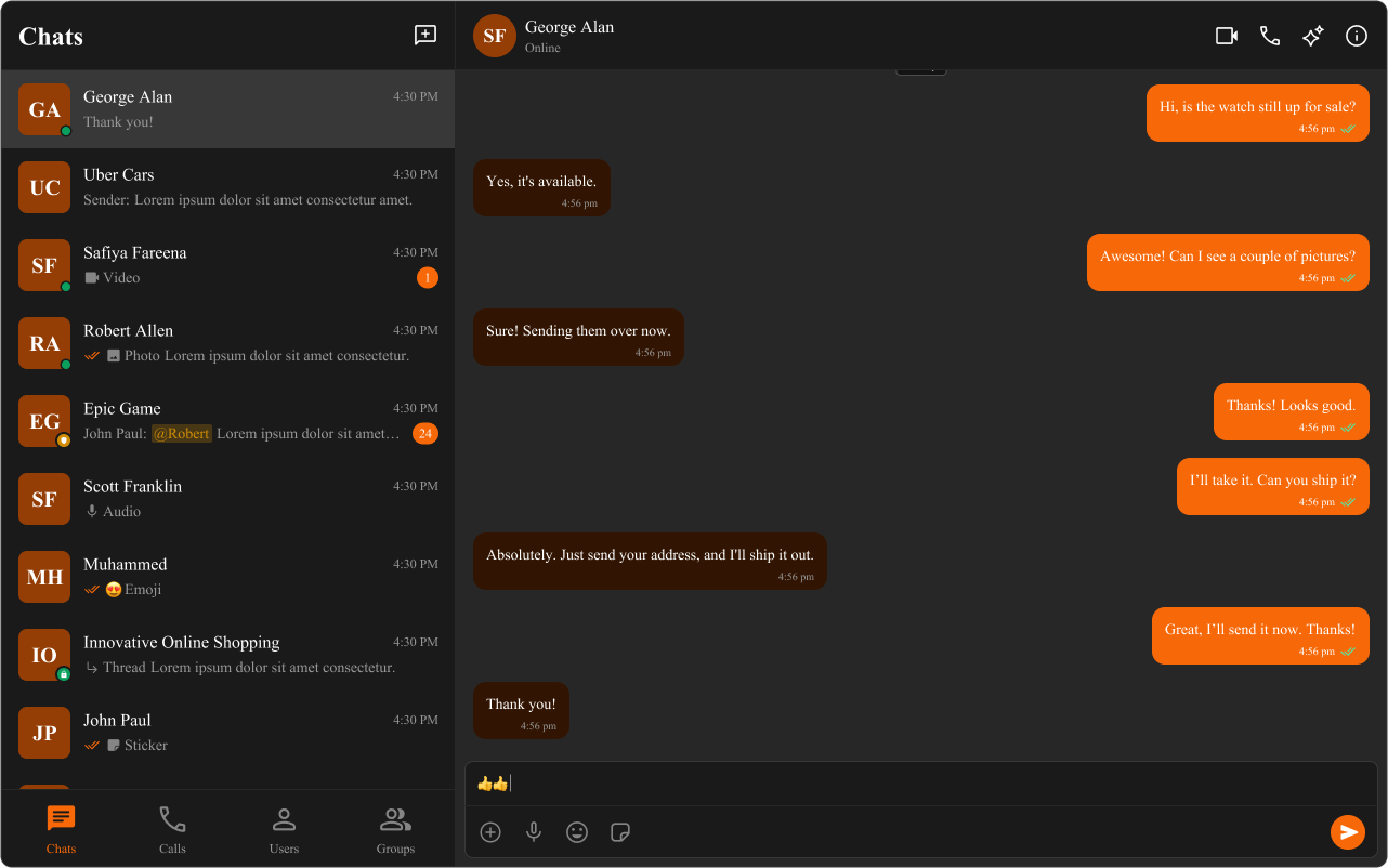
/* Default (Light) Theme */
.cometchat {
  --cometchat-primary-color: #f76808;
  --cometchat-neutral-color-300: #fff;
  --cometchat-background-color-03: #feede1;
  --cometchat-extended-primary-color-500: #fbaa75;
  --cometchat-icon-color-highlight: #f76808;
  --cometchat-text-color-highlight: #f76808;
}

/* Dark Theme */
@media (prefers-color-scheme: dark) {
  .cometchat {
    --cometchat-primary-color: #f76808;
    --cometchat-neutral-color-300: #311502;
    --cometchat-background-color-03: #451d02;
    --cometchat-extended-primary-color-500: #943e05;
    --cometchat-icon-color-highlight: #f76808;
    --cometchat-text-color-highlight: #f76808;
    --cometchat-message-seen-color: #f76808;
    --cometchat-neutral-color-50: #1a1a1a;
  }
}

πŸ“š Helpful Resources

Enhance your design and development workflow with the following resources:

πŸ“¦ UI Kit Source Code

Explore the complete list of color variables and hex values on GitHub.View on GitHub

🎨 Figma UI Kit

Access the Figma UI Kit for a fully integrated color palette and seamless customization.View on Figma