Overview
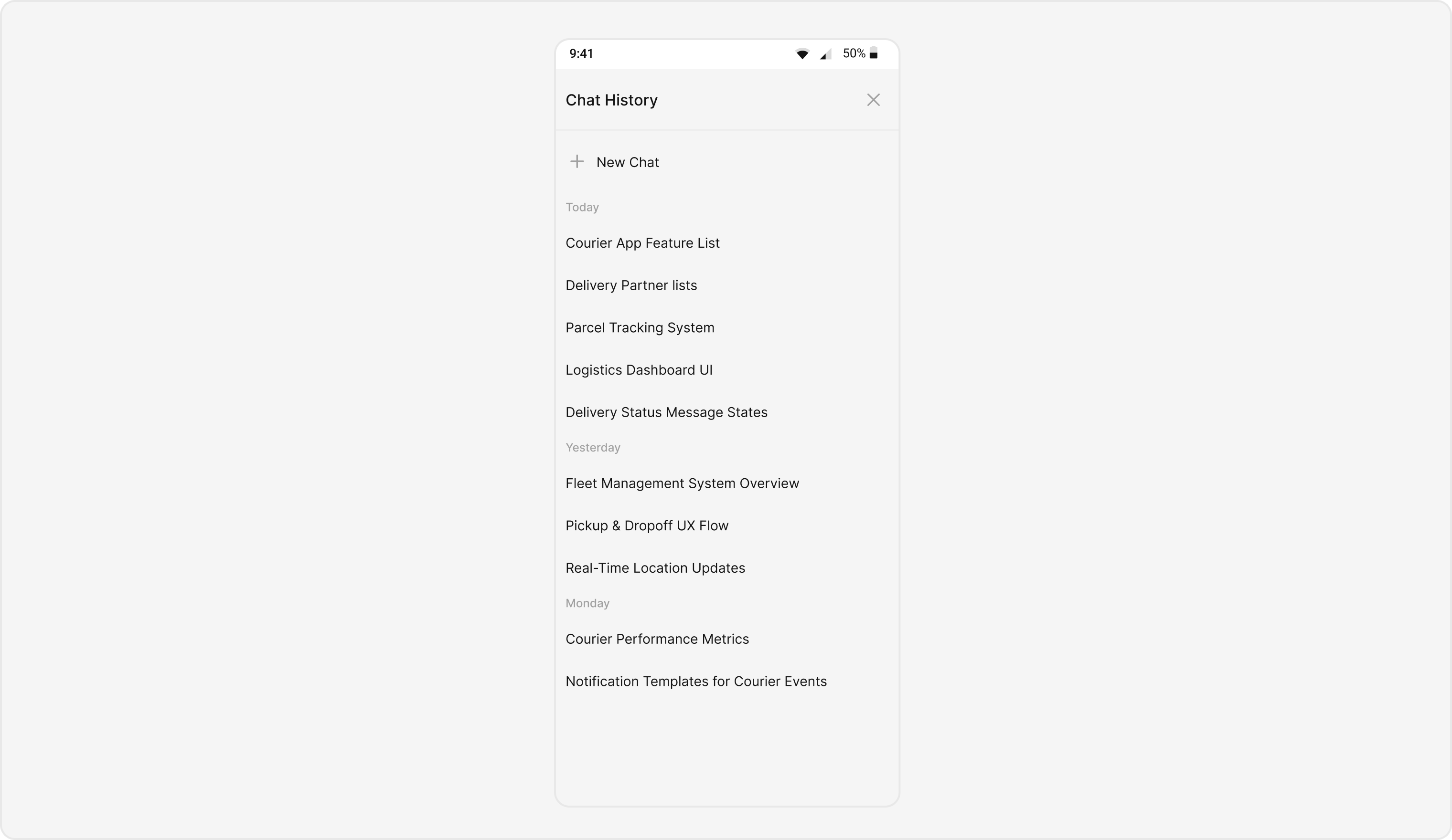
TheAI Assistant Chat History component is a pre-built user interface element designed to display the conversation history between users and an AI assistant within a chat application. It provides a structured and visually appealing way to present past interactions, making it easy for users to review previous messages and context.
Usage
Integration
CometChatAIAssistantChatHistory, as a Composite Component, offers flexible integration options, allowing it to be launched directly via button clicks or any user-triggered action.
The following code snippet exemplifies how you can seamlessly integrate the AI Assistant Chat History component into your application.
- TypeScript
Actions
Actions dictate how a component functions. They are divided into two types: Predefined and User-defined. You can override either type, allowing you to tailor the behavior of the component to fit your specific needs.onMessageClicked
Function invoked when a chat history item is clicked, typically used to open an AI assistant chat screen.- TypeScript
onNewChatButtonClick
Function triggered when the new chat button is clicked, typically used to start a new conversation with the AI assistant.- TypeScript
onClose
Function activated when the close button is clicked, usually to exit the chat history view.- TypeScript
onError
Function invoked when an error occurs during message fetching or any other operation.- TypeScript
Customization
TheCometChatAIAssistantChatHistory component offers a variety of customization options to tailor its appearance and functionality to better fit your application’s needs. These customizations are categorized into two main areas: Style and Functionality.
Style
Using Style you can customize the look and feel of the component in your app. These parameters typically control elements such as the color, size, shape, and fonts used within the component.- TypeScript
Functionality
These are a set of small functional customizations that allow you to fine-tune the overall experience of the component. With these, you can control various aspects of the component’s behavior. Below is a list of customizations along with corresponding code snippets:| Props | Description | Code |
|---|---|---|
| user | Sets the user whose chat histories with the AI assistant need to be fetched. This is a required property for the component to function properly. | user={userObject} |
| group | Sets the group whose chat histories with the AI assistant need to be fetched. Can be used instead of user for group chats. | group={groupObject} |
| LoadingStateView | Custom loading state view component to be displayed while fetching chat history | LoadingStateView={() => <YourCustomLoader />} |